Project Overview
The Challenge
ROSH Studios needed an engaging way to improve attendee interaction at Comic-Con Utrecht. Gen Z attendees (16-27) were missing key areas due to overwhelming size and chaotic navigation. Our goal: create a gamified experience combining escape room appeal with scavenger hunt simplicity.
- Client: ROSH Studios - Event organizers for Comic-Con Utrecht
- Problem: Static booths had low engagement; attendees missed key areas; no digital interactivity
- Solution: Browser-accessible PWA with task-based challenges, badge rewards, and interactive map
Concept Evolution - 3 Iterations
Our concept evolved through research and client feedback:
- AR Anime Villain Escape Room: Choose-your-villain adventure with anime settings, digital 3D assistant. Rejected due to space constraints and AR concerns from surveys (only 22.2% interested in VR/AR)
- Labyrinth Game: Physical/digital labyrinth with elemental-themed challenges (Earth, Fire, Water, Air). Simplified but still too complex for Comic-Con environment
- Scavenger Hunt PWA: Final concept - simple, browser-accessible, aligns with 43.5% interest in scavenger hunts and client's scalability needs
Methodology
Double Diamond + DOT Framework
We combined Double Diamond (Discover, Define, Develop, Deliver) with DOT Framework research methods for comprehensive user-centered design:
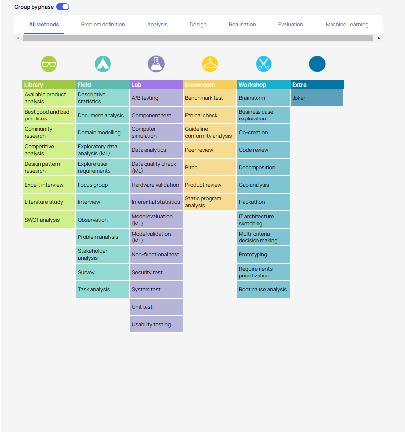
Research Methods Used
- Library: Literature research on digitalization, nerd/geek culture, competitive analysis
- Field: Surveys (46 responses), interviews (8 attendees), on-site observations at Comic-Con
- Lab: Figma prototype testing, A/B testing on map markers
- Showroom: Client presentations to ROSH Studios
- Workshop: Team brainstorming sessions, affinity diagrams
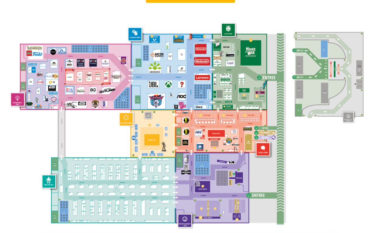
Comic-Con Utrecht Floor Map
We based our PWA map on the actual convention layout:
Phase 1: Discover
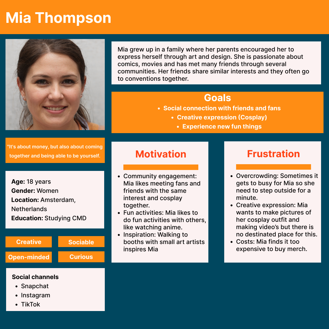
User Persona - Mia Thompson
Based on surveys and interviews, we created Mia: an 18-year-old from Amsterdam studying Communication & Multimedia Design. She's passionate about cosplay, anime, and creative expression. Goals: social connection with friends/fans, creative expression through cosplay, experience new fun things. Frustrations: overcrowding, costs, no designated place for photos/videos.
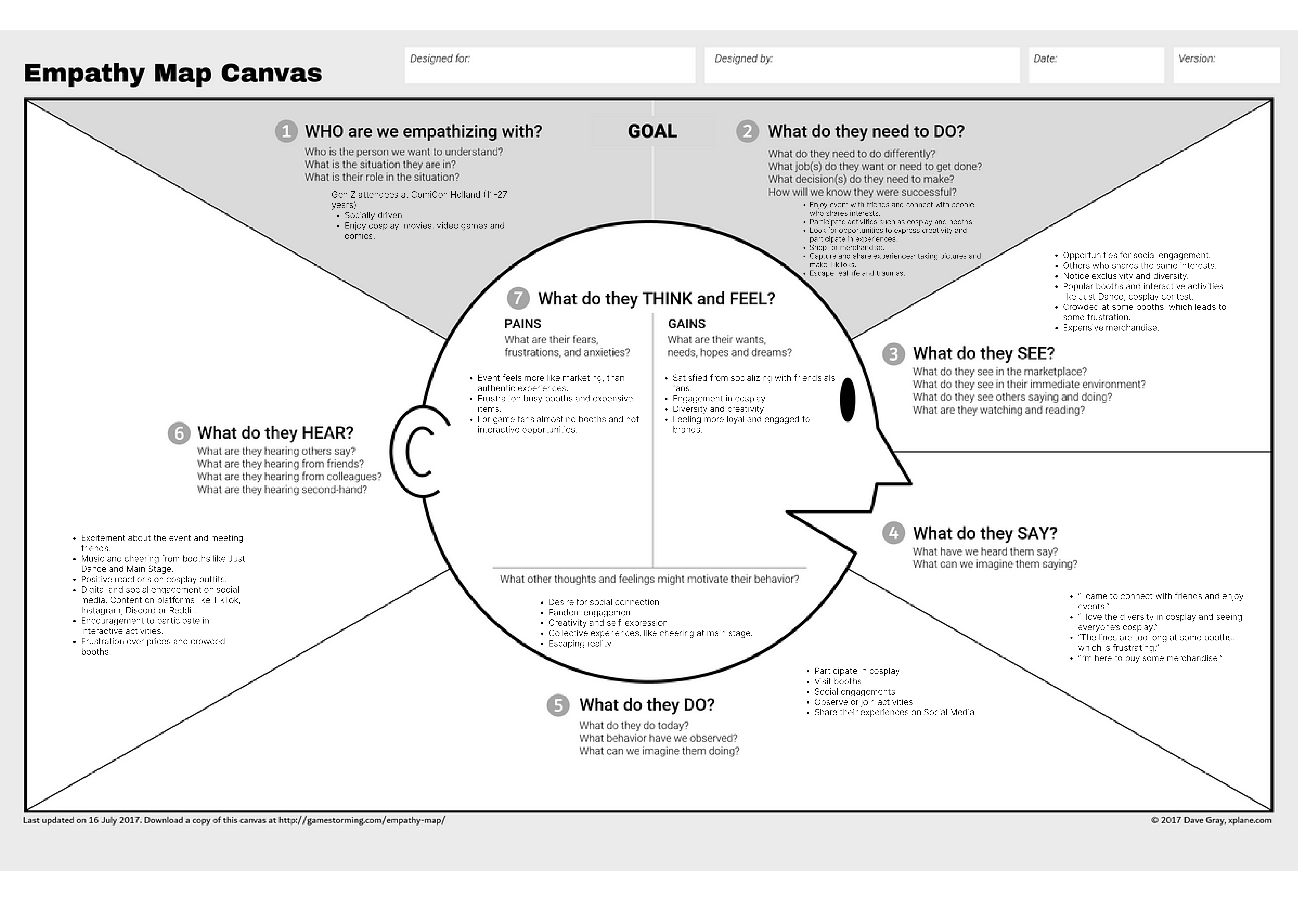
Empathy Map Canvas
We created an empathy map to understand Gen Z attendees at ComicCon Holland (11-27 years). The map explores what users Think & Feel (fears about inauthentic experiences, wants to socialize), See (popular booths, crowded areas), Say ("I came to connect with friends"), Do (participate in cosplay, visit booths), and Hear (music, positive reactions on social media).
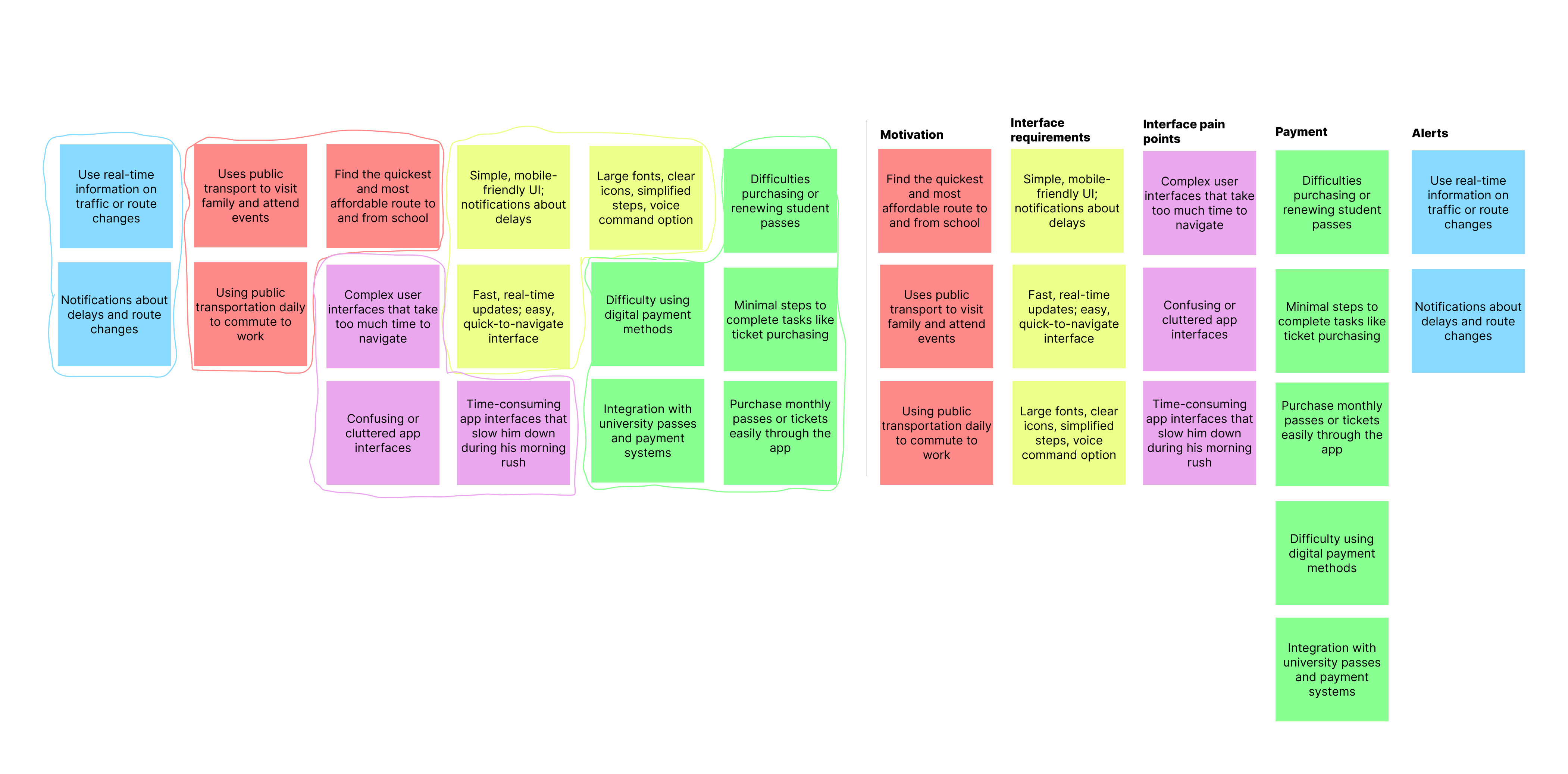
Affinity Map - User Research Synthesis
We organized our research findings into an affinity map with categories: Motivation (find quickest routes, visit family/events), Interface Requirements (simple mobile-friendly UI, large fonts, voice commands), Pain Points (complex interfaces, time-consuming apps), Payment (difficulty with digital methods), and Alerts (real-time notifications about delays).
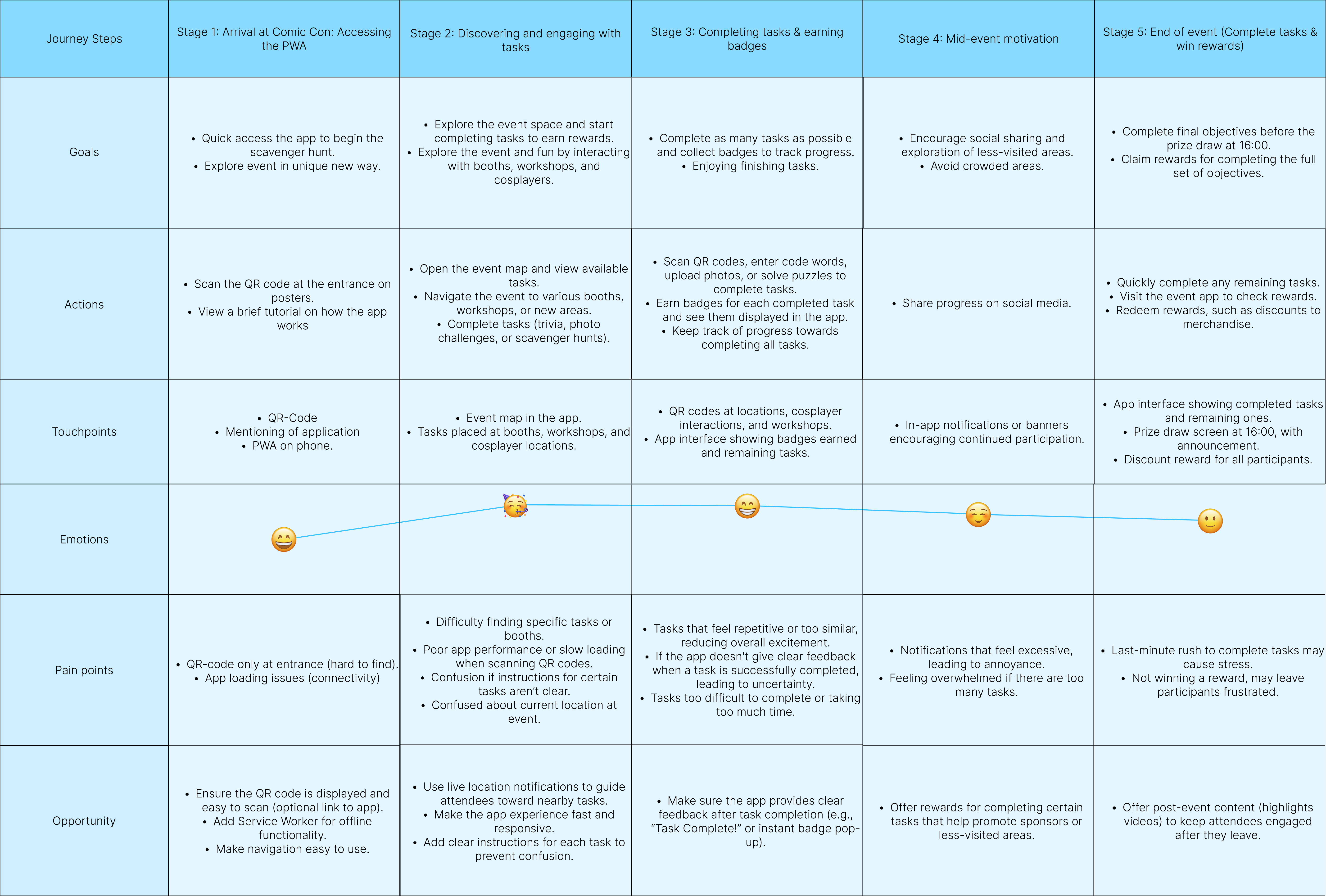
User Journey Map - 5 Stages
We mapped the complete user journey through 5 stages: (1) Arrival at Comic Con - scanning QR code, (2) Discovering & engaging with tasks - exploring event map, (3) Completing tasks & earning badges - photo challenges, trivia, (4) Mid-event motivation - social sharing, (5) End of event - completing tasks, claiming rewards. Each stage includes Goals, Actions, Touchpoints, Emotions, Pain Points, and Opportunities.
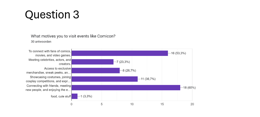
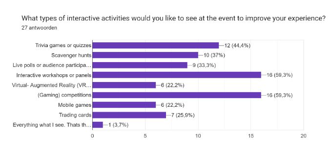
Survey Results - What Gen Z Wants
We surveyed 46 Comic-Con attendees. Key findings: 59.3% wanted interactive workshops, 59.3% gaming competitions, 54.3% escape rooms, 43.5% scavenger hunts. Only 22.2% showed interest in VR/AR - leading us to pivot away from our initial AR concept.
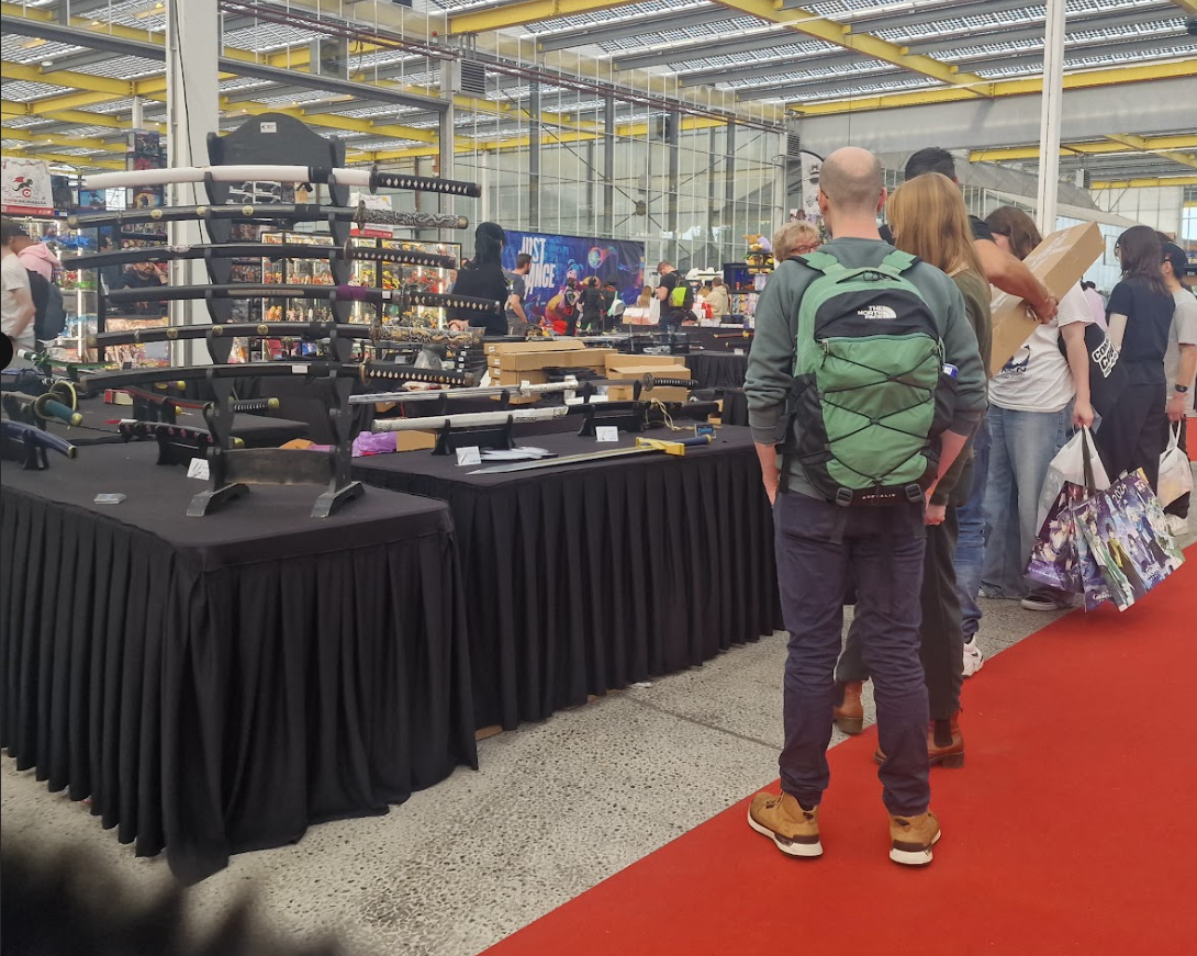
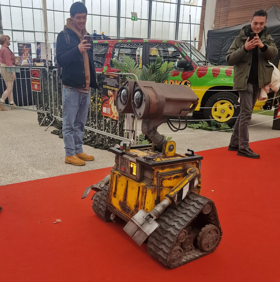
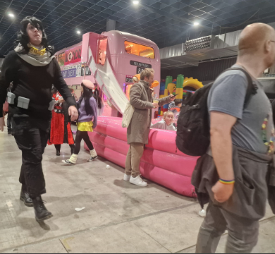
On-Site Observations at Comic-Con
I conducted on-site observations capturing photos of popular booths. High engagement: Ghost Corps, Padawan Outpost, cosplay contests, Just Dance zones. Low engagement: static merchandise booths, food areas.
Interview Results (8 Attendees)
I conducted 3 interviews, team conducted 5 more. Key findings:
- Motivations: Cosplay enthusiasm, merchandise (anime posters, figurines), social atmosphere
- Strengths: Variety of merchandise, Art Alley, creative cosplay displays
- Desired Activities: Gaming tournaments, drawing contests, cosplay workshops
- Pain Points: High food prices, lack of seating, confusing navigation
Phase 2: Define
Meeting with ROSH Studios - Concept Selection
We presented 6 concepts to the client:
- Speed Drawing Competition: Rejected - space issues
- Hologram Workshop: Rejected - high costs
- Scavenger Hunt PWA: ✓ SELECTED - simple, engaging, scalable
- Interactive Screens: Rejected - lacked depth
- Werewolf/Mafia Games: Rejected - too time-consuming
- AR Escape Room: Rejected - VR/AR concerns from surveys
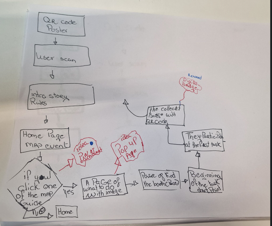
Flowchart Diagram - App Question Flow
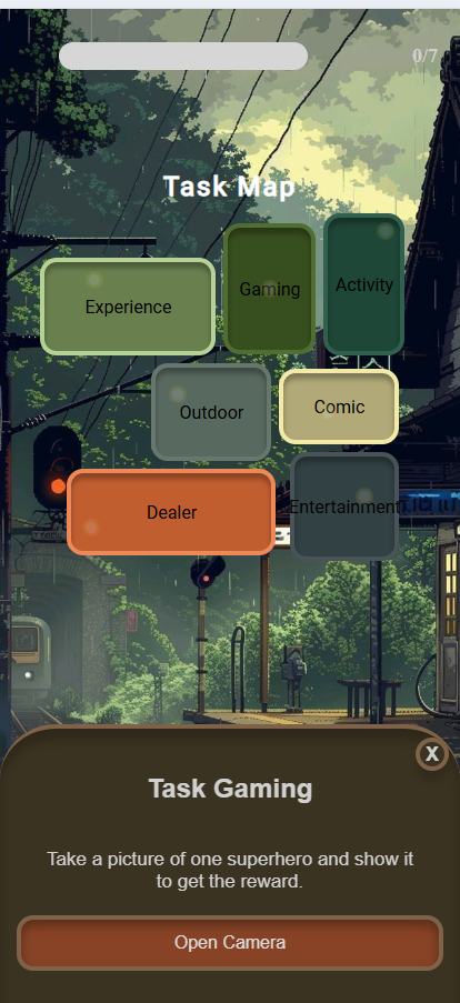
I created a flowchart diagram that defines how to start the flow of each question in the app. The flow starts with the QR Code Poster → User Scan → Intro Story/Rules → Home Page Map Event. Then if users click a map location, they see an Idea Pop-up → Task Page with instructions and image. After completing the task (Pose or Find the booth), they collect a Badge with their record, participate in subsequent tasks, and progress toward completion.
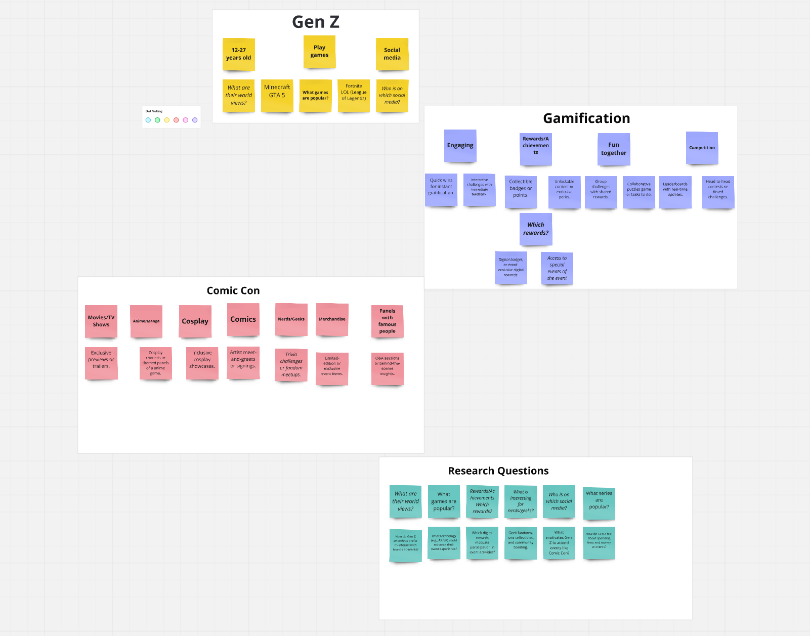
Brainstorming & Research Diagrams
We created mind maps to organize our research on Gen Z (12-27 years old, gaming preferences, social media), Gamification elements (rewards, achievements, competition), Comic Con categories (Cosplay, Anime/Manga, Merchandise, Panels), and Research Questions to guide our user studies.
Prototype Before & After Comparison
The initial design of the Scavenger Hunt PWA featured a simple navigation system with a task-based map. Users could select rooms to reveal challenges, but the tasks were generic, lacked creativity, and had unclear instructions. There was no feedback mechanism for tracking progress or identifying completed tasks. The prototype's color scheme did not align with Comic-Con Utrecht's vibrant atmosphere.
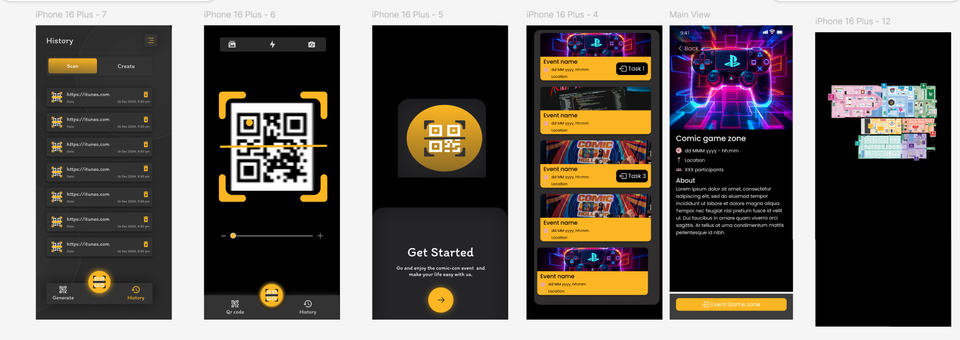
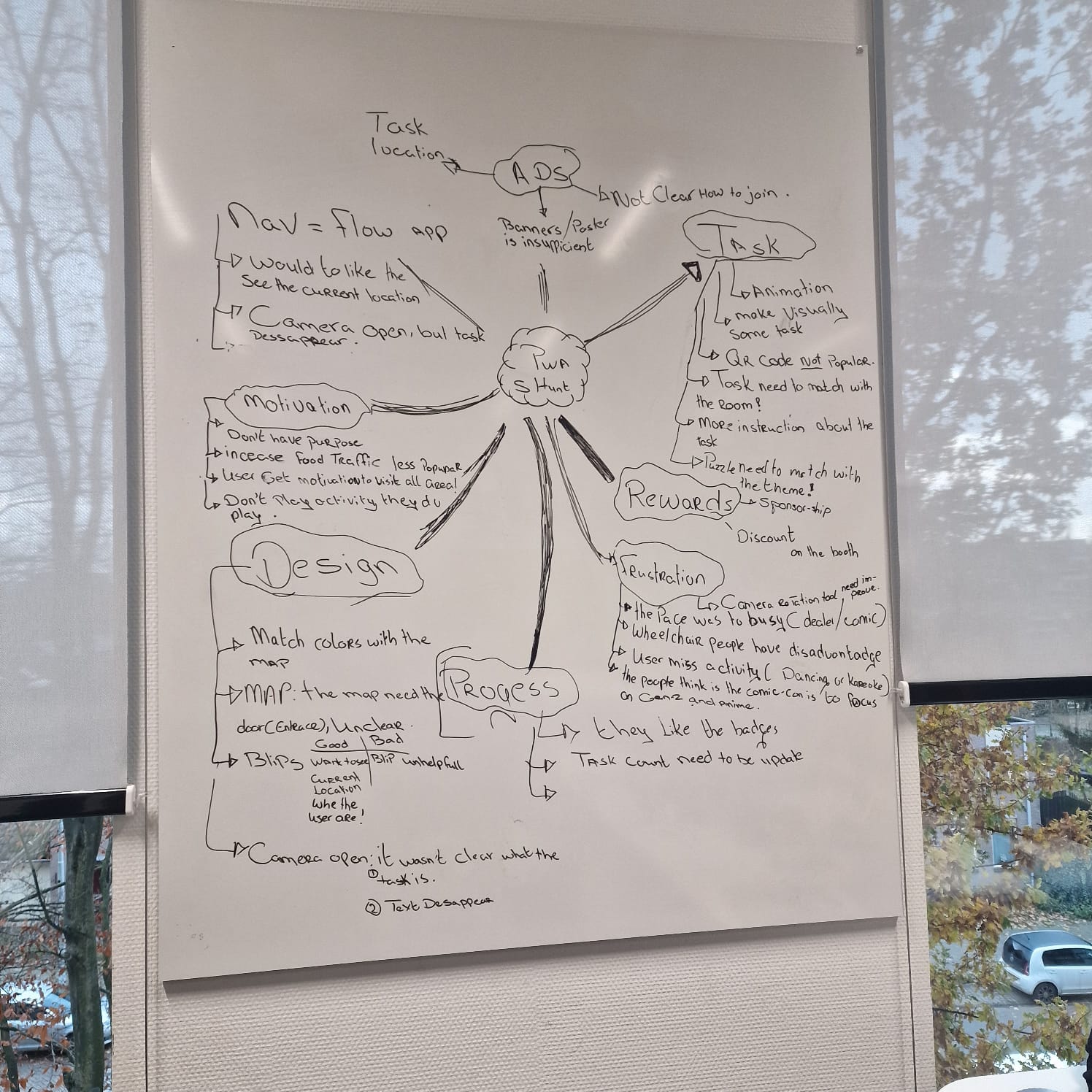
Reasons for Iteration - User Testing Issues
During user testing at Comic-Con Utrecht, several critical usability challenges were identified based on real user feedback:
- Task Clarity: Many participants found the instructions vague and struggled to understand what they needed to do. Tasks used terms like "around the Comic-Con" without specifying locations or actions, leaving users confused.
- Navigation Flow: Users were unable to track their progress effectively. Blinking markers on the map caused distraction, and there was no visual indicator to show completed tasks.
- Visual Design: The design lacked Comic-Con-specific branding and thematic elements, making it feel disconnected from the event's vibrant environment.
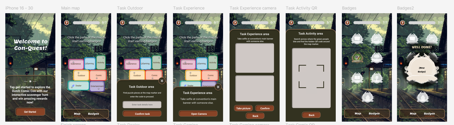
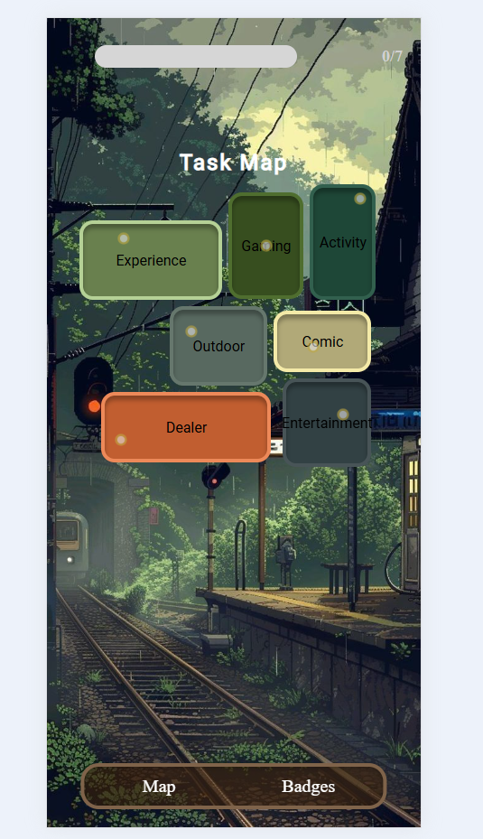
All Prototype Iterations
After the changes, the map visuals improved with clear room types and better task explanations. Progress markers like badges and a progress bar were added for instant feedback. The design evolved through multiple iterations:
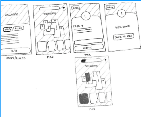
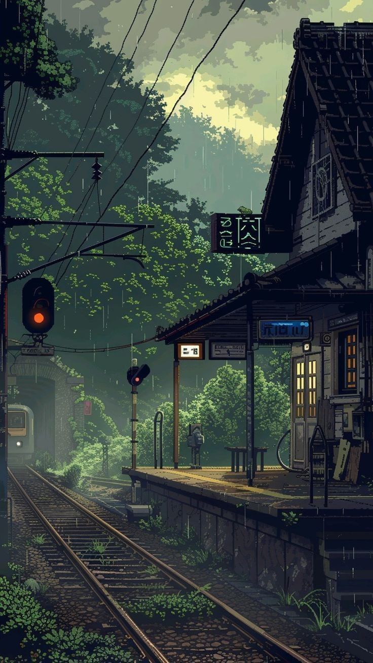
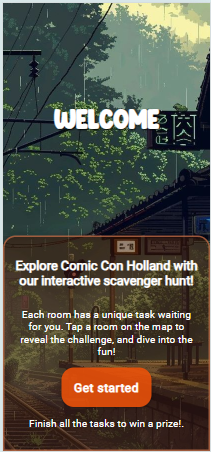
Final Prototype - Ghibli Theme
The final PWA uses a Studio Ghibli-inspired aesthetic with warm earth tones and anime train station background. This version incorporated all user feedback: clearer task instructions, progress tracking with badges, and Comic-Con branding that matched user expectations.
Validation of Iteration
The new version of the prototype was tested and checked with a few rounds of feedback:
- Task Instructions: Users liked the clearer and more direct task instructions. Clearer and more actionable instructions were positively received.
- Progress Tracking: Elements such as badges and progress bars helped users better grasp task completion and progress. Enhanced visual indicators improved user understanding.
- Comic-Con Concept Design: The new design, featuring Comic-Con branding and themes for the event, matched user expectations well and was appreciated for its better appearance.
Pixel Paranoia Studio - Branding
We created our studio identity with the "paranoid eye" motif - representing awareness and observation. The website features a cyberpunk neon aesthetic with anime-style mascot.
Phase 3: Develop
PWA Development - My Contributions
I focused on three key areas of the PWA:
- Task Pop-Up Flow: Used addEventListener to trigger pop-ups, dynamic DOM manipulation for task descriptions and input fields based on task type (camera or text)
- Blip Markers: CSS positioning for task locations on map, hover effects with CSS transitions, simulated live location tracking
- Mobile Responsiveness: CSS media queries for different screen sizes, tested on Android and iPhone, fixed overlapping elements
User Testing - Two Phases
Phase 1 - Comic-Con Utrecht (Real Environment): We tested the prototype at the actual event with attendees. Scenario: "You're at Comic-Con looking for an activity to explore this giant place. You see a QR code for a convention-wide game. Can you find your way around and finish the game?"
Phase 2 - School (Controlled Environment): After identifying issues at Comic-Con, we conducted controlled testing at school to validate our improvements before the next iteration.
Issues Found
- Task instructions vague ("around the comic-con")
- Blinking map markers caused confusion
- No progress feedback after task completion
- Many missed onboarding tutorial
- Dark colors didn't match Comic-Con vibe
- QR codes/banners not visible enough
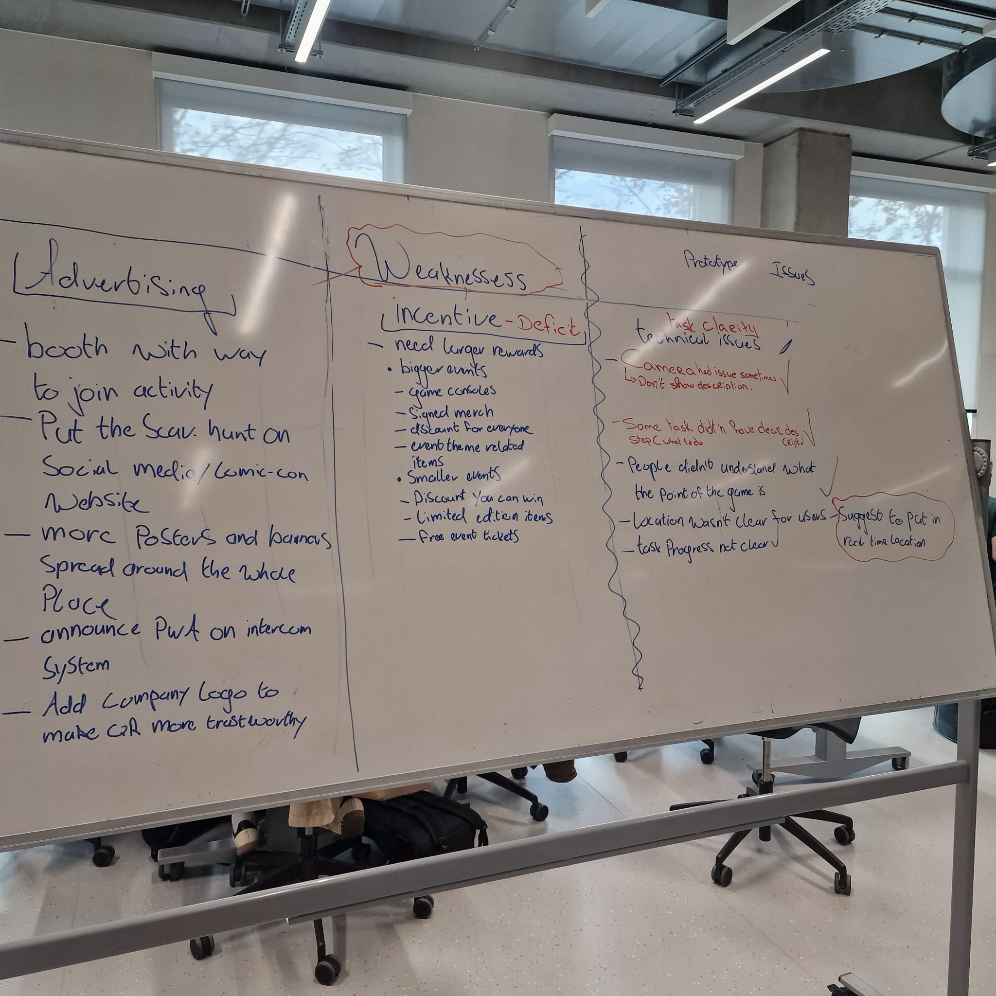
Improvements Made
- Rewrote task descriptions with precise actions
- Changed to static markers with legend
- Added celebratory pop-ups on completion
- Made onboarding more engaging/required
- Updated to vibrant Comic-Con colors
- Recommended booth promotion strategy
Phase 4: Deliver
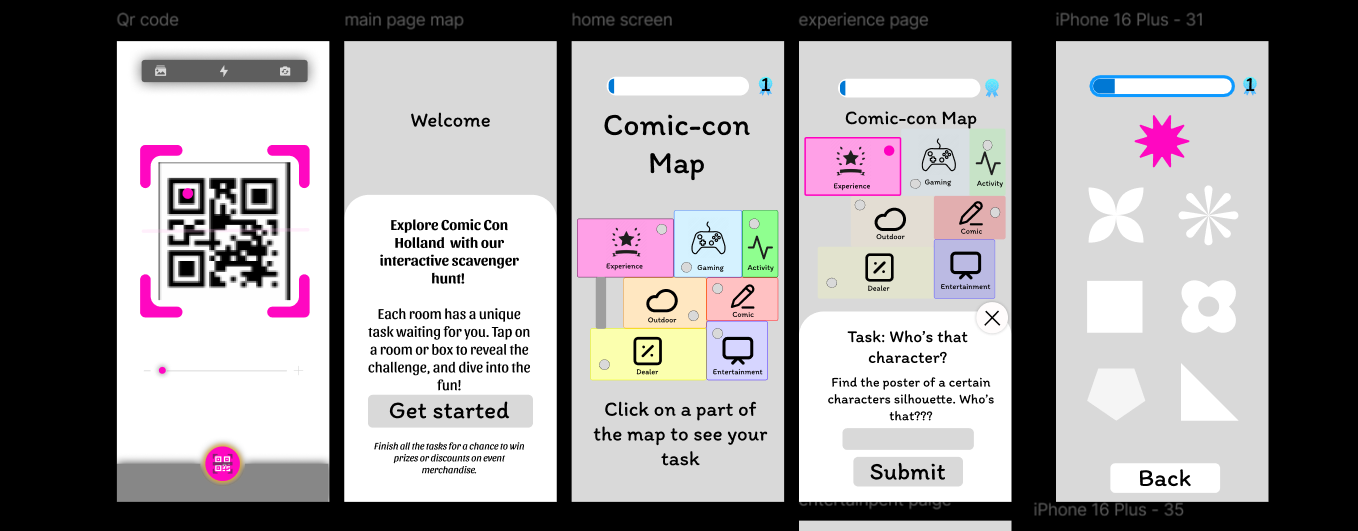
Final PWA - Ghibli Theme
The final PWA features a Studio Ghibli-inspired aesthetic with warm earth tones and anime train station background. Three main screens:
Badge Design System
7 unique badges representing each convention zone. Badges start grayscale and unlock with color upon task completion:


Advice Report for ROSH Studios
We delivered a comprehensive report with recommendations:
- Advertising: Booth with clear way to join, promote on social media, more posters/banners, intercom announcements, add company logo to QR
- Rewards: Budget-friendly options (Pepernoot), merchandise discounts, digital collectibles
- Future Features: Replace QR codes with NFC tags, enhanced rewards system, better visibility materials
My Contributions
Research & Design
- Conducted 3 user interviews at Comic-Con
- On-site observations capturing booth engagement
- Distributed surveys to gather Gen Z preferences
- Created Mia Thompson persona from research data
- Designed Figma prototypes (1st and 2nd iterations)
- Developed Labyrinth Game concept (before pivot)
- Participated in competitive/SWOT analysis
Development & Testing
- Built task pop-up flow with dynamic DOM manipulation
- Created blip markers with CSS positioning/transitions
- Implemented mobile responsiveness with media queries
- Collaborated on Git merge conflict resolution
- Conducted user testing at Comic-Con Utrecht
- Documented findings in GitLab Wiki (36 pages)
- Co-authored Advice Report for ROSH Studios
Video Demo
Watch the Con-Quest PWA in action - demonstrating the scavenger hunt experience at Comic-Con Utrecht.
Team - Pixel Paranoia
Developed as part of Pixel Paranoia creative studio at Fontys ICT for client ROSH Studios. We created both the studio website and the Con-Quest PWA following Double Diamond methodology across 4 phases.
Explore More Projects
Check out my other collaborative and individual work!