Project Overview
The Challenge
Fontys University of Applied Science tasked our team with creating a branding website for ICT & Media Design to attract international students. Through user research, we discovered the existing website had critical issues:
- Website described as "chaotic and all over the place"
- Only 2-line semester descriptions - no detailed curriculum
- No information about coding courses (HTML, CSS, JavaScript)
- Job opportunities listed without any descriptions
- Missing information about Adobe programs taught
The Goal
Create a user-friendly branding website that encourages international students to join ICT & Media Design by addressing the identified pain points:
- Clear, structured information architecture
- Detailed semester-by-semester curriculum breakdown
- Showcase actual courses: UX Design, Media Production, Front-end Development
- Include student project examples and schedule visualizations
- Highlight job opportunities and internship preparation
Methodology
DOT Framework (Development Oriented Triangulation)
We applied the DOT Framework to ensure our research covered both stakeholder needs and industry standards:
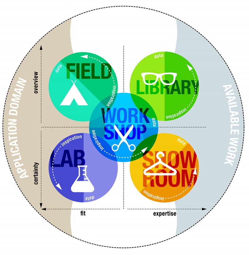
- Library (Desk Research): Explored existing guidelines, competitor websites, and design patterns to establish a baseline for our solution
- Field Research: Conducted surveys (30 respondents) and in-depth interviews (6 students) to understand user needs, desires, and pain points
- Lab Testing: Tested prototypes with target users to validate design decisions and identify usability issues
- Showroom: Presented designs to stakeholders and received expert feedback to refine our approach
- Workshop: Collaborative brainstorming sessions to explore design possibilities and iterate on solutions
Research Methods Applied
- Competitive analysis (The Hague University, TU/e)
- Available product analysis
- Design pattern research
- Stakeholder analysis
- Affinity mapping
- User requirements & user stories
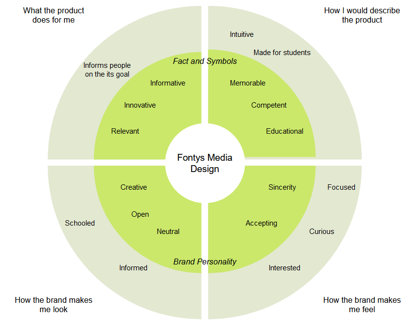
Brand Wheel
We created a Brand Wheel to define Fontys Media Design's identity and guide our design decisions:
User Research
Interview Insights - Direct Quotes from Students
We interviewed students from Semester 2 and Semester 5 to understand their experience with the existing website:
- "There was a lot of things all over the place. I had to jump between pages trying to find information... it was not very concise, it was a bit chaotic." - Agata, Semester 2
- "The curriculum information is only about 2 lines of text. I would like to see what classes there will be - we currently get UX, Media Production and Front-end Development but these were not mentioned on the site." - Iris, Semester 2
- "It's relevant to learn exactly what would be taught in media design, because the meetings and website are very vague." - Nikita, Semester 5 (Intern)
- "The structure makes it difficult to find information. It's better to talk to teachers because information is hard to find on the page." - Kristian, Semester 2
Key Findings from Research
- 100% wanted semester content before joining
- Website consistently described as "chaotic"
- Only 2-line semester descriptions available
- No info about coding courses (HTML, CSS, JS)
- Missing Adobe programs information
- Job opportunities listed without descriptions
- Information architecture was confusing
Prioritized User Requirements
- Very High: Easy to find job with high salary info
- High: English-taught classes emphasis
- High: Internship preparation & company connections
- High: Practical approach to learning
- High: Detailed curriculum per semester
- Medium: Creative freedom showcase
- Clear navigation bar with structured layout
Competitor Analysis Insights
We analyzed direct competitors (The Hague University - UX Design) and indirect competitors (TU/e - Computer Science) to identify best practices:
- The Hague: Student testimonials, "Student for a day" shadowing option, semester visualization graphs, alumni testimonials, clear user flow (Introduction → Before → During → After programme)
- TU/e: Campus tours, experience days, "Study in figures" visualization (contact hours, passing rate), in-depth curriculum explanation, master study options
- Missing from Fontys: Webinars link on Media Design page, contact coordinator option, detailed job qualifications
Design Process
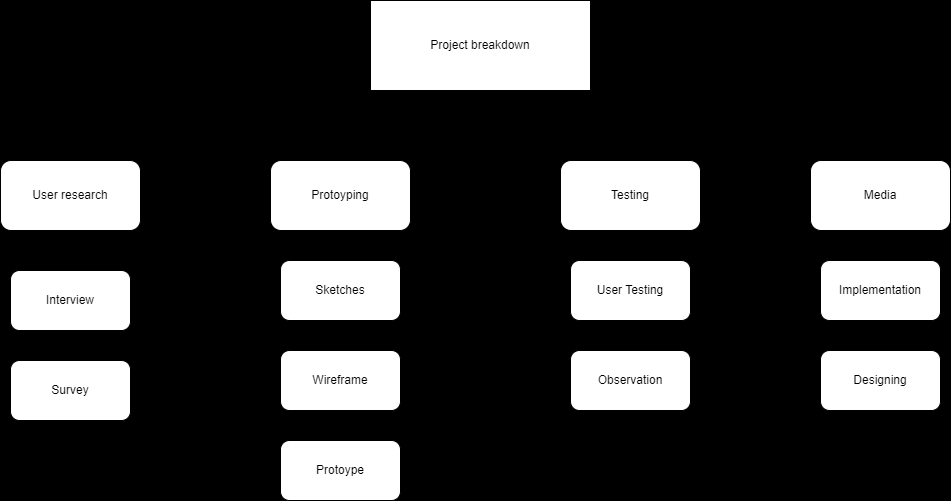
Project Breakdown & User Flow
We created a flowchart to map out the website structure and user journey through the different pages and sections.
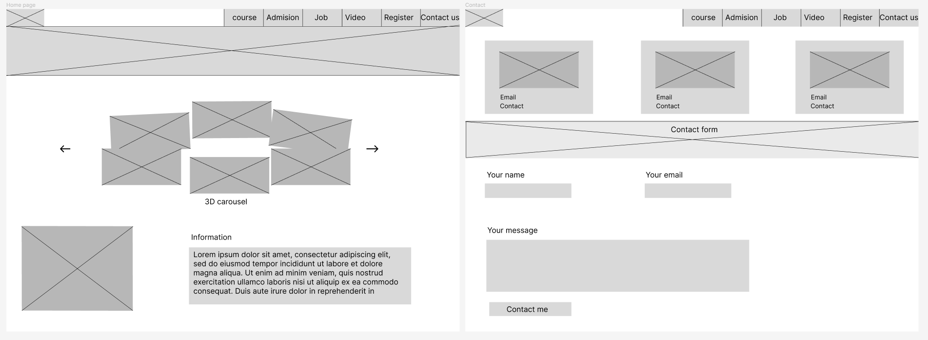
Lo-Fi Wireframes - Homepage & Contact Page
Initial sketches showing the layout structure for the homepage hero section, navigation menu, and contact form. We prioritized clear information hierarchy and easy access to semester curriculum details based on user research findings.
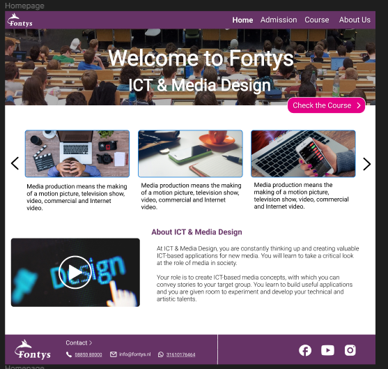
Hi-Fi Design Mockup
Final design iteration incorporating Fontys brand colors (purple/pink gradient), modern typography, and visual elements. Features include semester breakdown cards, student project showcases, and clear call-to-action buttons for prospective students.
Final Implementation
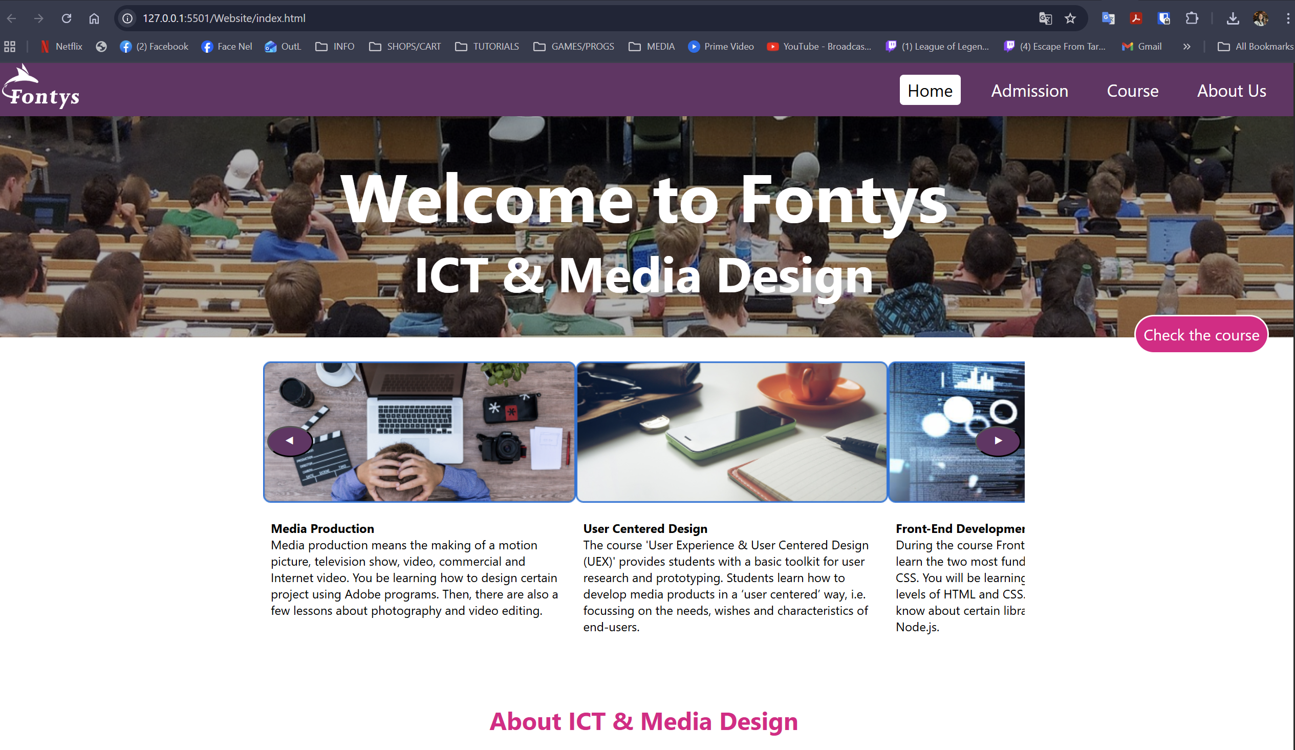
Homepage
Hero section with engaging visuals and clear navigation. Features quick access to curriculum, student projects, and application information - addressing the "chaotic" navigation issue users reported.
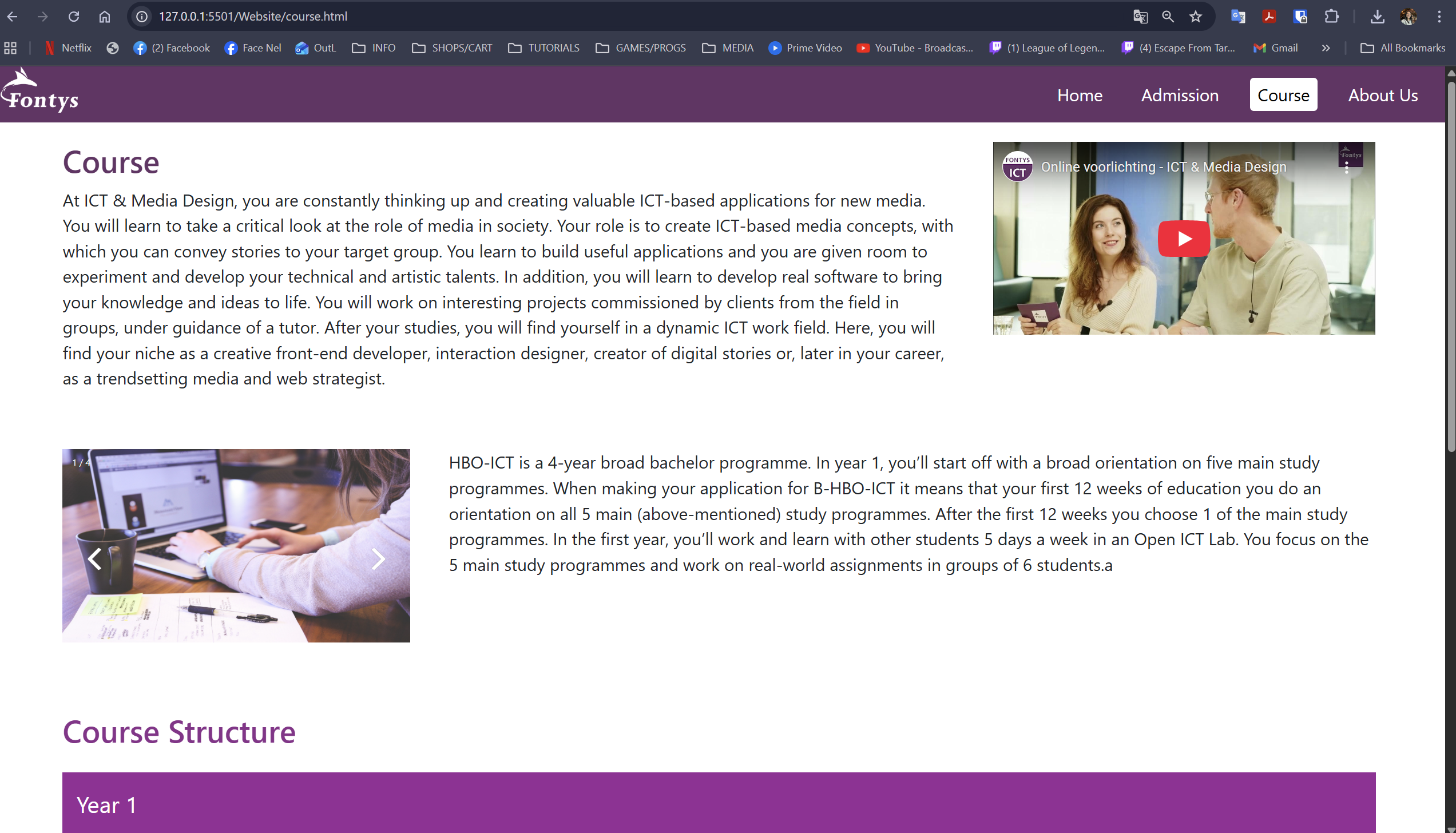
Course Overview
Detailed breakdown of what students learn: UX Design, Media Production, and Front-end Development. Solves the problem of vague 2-line descriptions by showing actual course content.
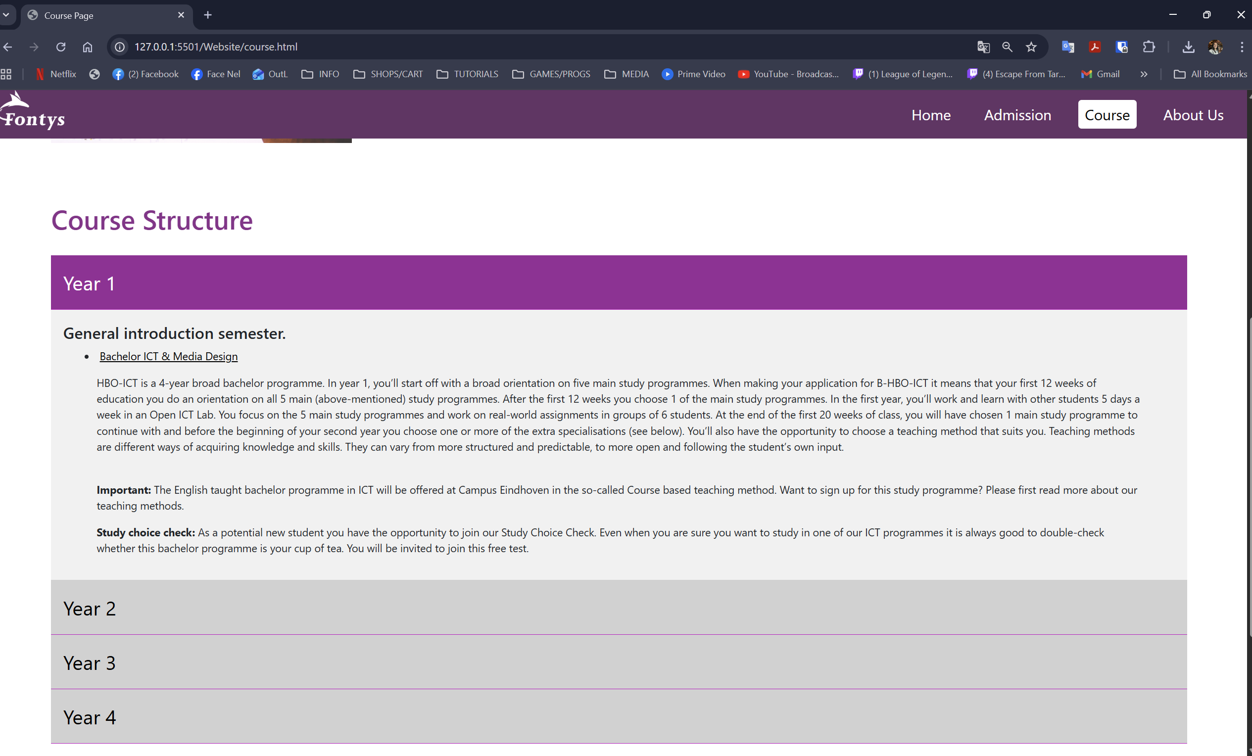
Semester Structure
Visual semester-by-semester curriculum breakdown showing progression from basics to internship. Addresses the #1 user request: knowing what they'll learn before enrolling.
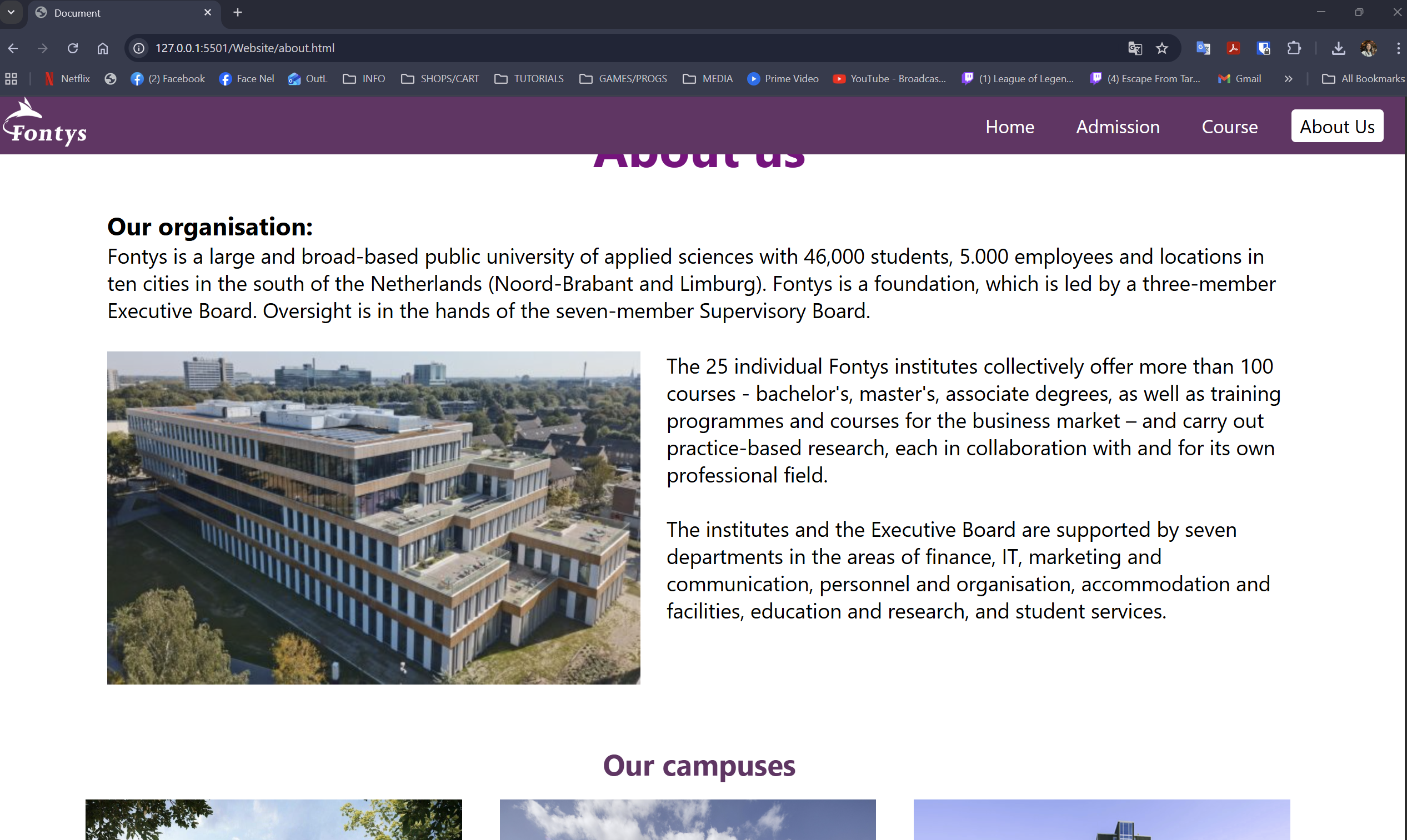
About & Contact
Information about the program, teaching approach, and direct contact options. Inspired by competitor analysis showing the value of accessible coordinator contact.
Tech Stack & Team
Technologies & Tools Used
My Contributions
- User Research: Conducted in-depth interviews with Semester 2 and Semester 5 students about their website experience
- Survey Analysis: Analyzed 30 survey responses to identify patterns and priorities
- Report Writing: Documented user study findings, competitor analysis, and user requirements
- Frontend Development: Developed website pages using HTML, CSS, and JavaScript
- Affinity Mapping: Organized research data to prioritize features
- User Stories: Created prioritized user stories based on research findings
Team Members & Roles
- Jakub Samulski - Report Writer, Frontend Developer
- Nigel Proveniers - Report Writer, Frontend Developer
- Paula Salazar - Report Writer, Frontend Developer
- Gendrik Victoria - Data Gatherer, Frontend Developer
- Roger Koeiman - Data Gatherer, Frontend Developer
- Amin Khachiche - Frontend Developer
Project Demo
Final Website Walkthrough
Watch the complete demonstration of the Fontys ICT & Media Design website we created:
Explore More Projects
Check out my other collaborative and individual work!