
Project Overview
The Challenge
LiveWall, a Dutch digital media agency located in Tilburg, Netherlands, tasked our group to increase the customer loyalty rate for their client, McDonald's corporation through a marketing campaign.
The Solution
Create a mini-game that will be used as a marketing tool to draw the attention of the target audience and encourage them to visit McDonald's, increasing customer loyalty rate.
Team Members
Team: Jakub Samulski, Nigel Proveniers, Gendrik Victoria, Amin Khachiche, Tom van Weersch, Paula Salazar
My Contributions
- Frontend development of game prototype using HTML, CSS, JavaScript
- Created falling animation mechanics for McDonald's products
- Collaborated on UI design and wireframing in Figma
- Participated in user testing sessions and feedback analysis
Methodology
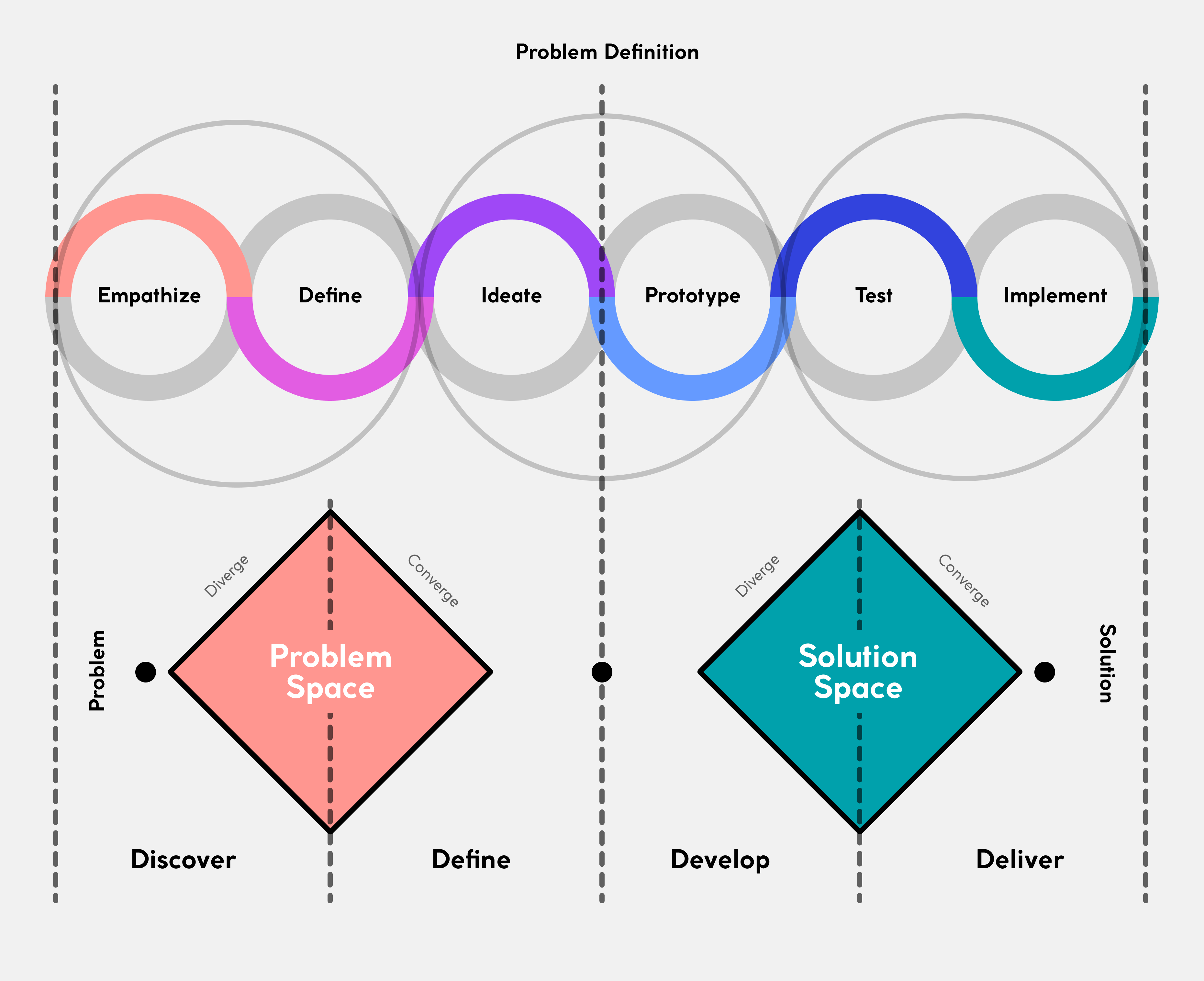
Design Thinking
Empathize → Define → Ideate → Prototype → Test → Implement
DOT Framework
Library · Field · Lab · Showroom · Workshop
User Research
Research Methods
- Surveys - Gathered quantitative data
- Interviews - In-depth conversations
- Competitor Analysis - Studied existing apps
- Literature Review - Gamification research
Key Findings
- 80-90% hadn't played existing McDonald's game
- Young adults spend significant time on mobile
- Users prefer quick games with tangible rewards
- Brand loyalty increases with interaction
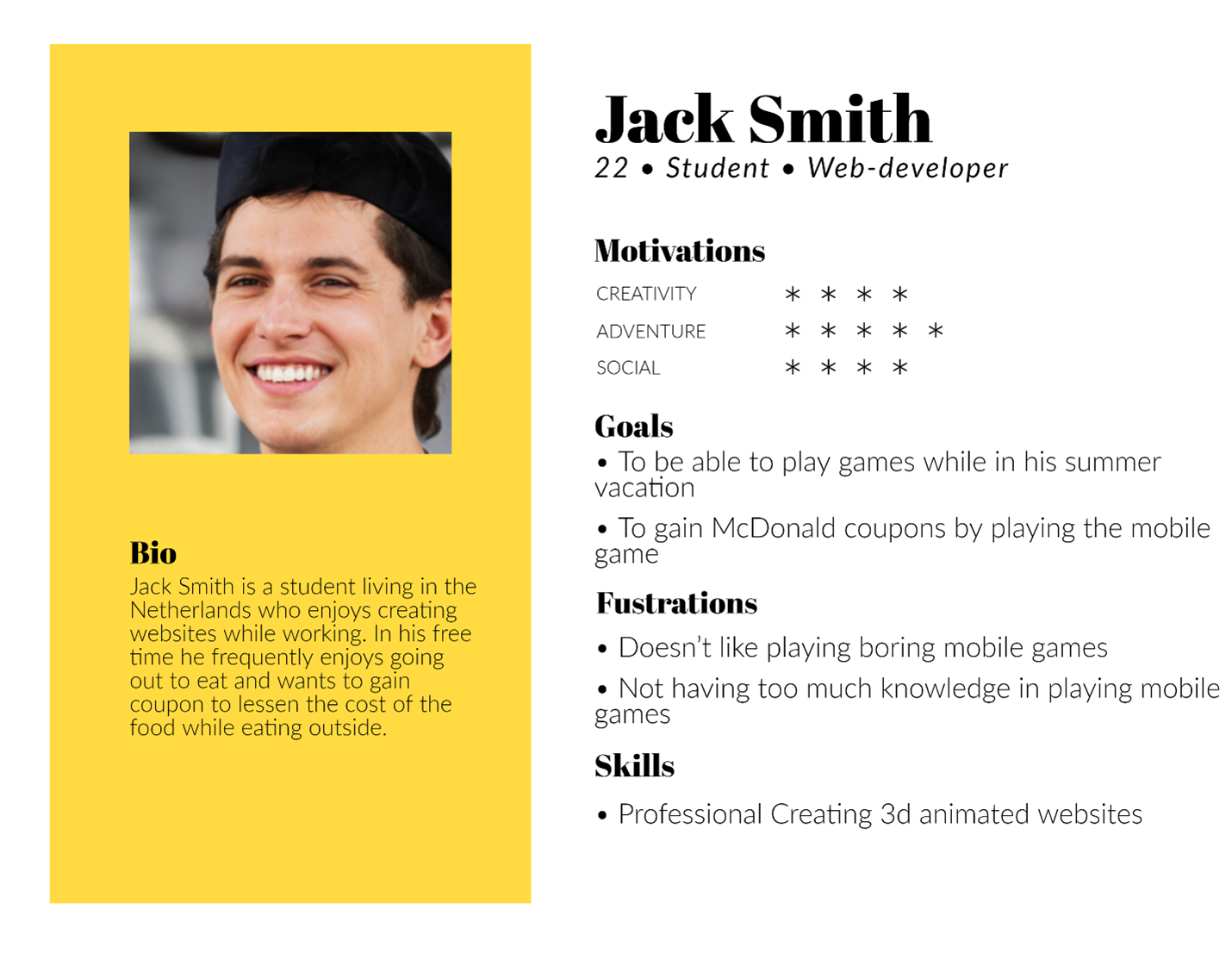
User Persona
Based on our research, we created a persona representing our target user - a young adult who frequently visits fast food restaurants, uses mobile apps daily, and is motivated by rewards and deals.
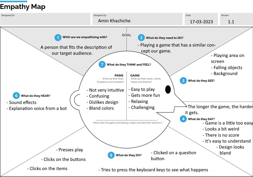
Empathy Map
The empathy map helped us understand what our target user thinks, feels, says, and does when interacting with fast food brands and mobile games.
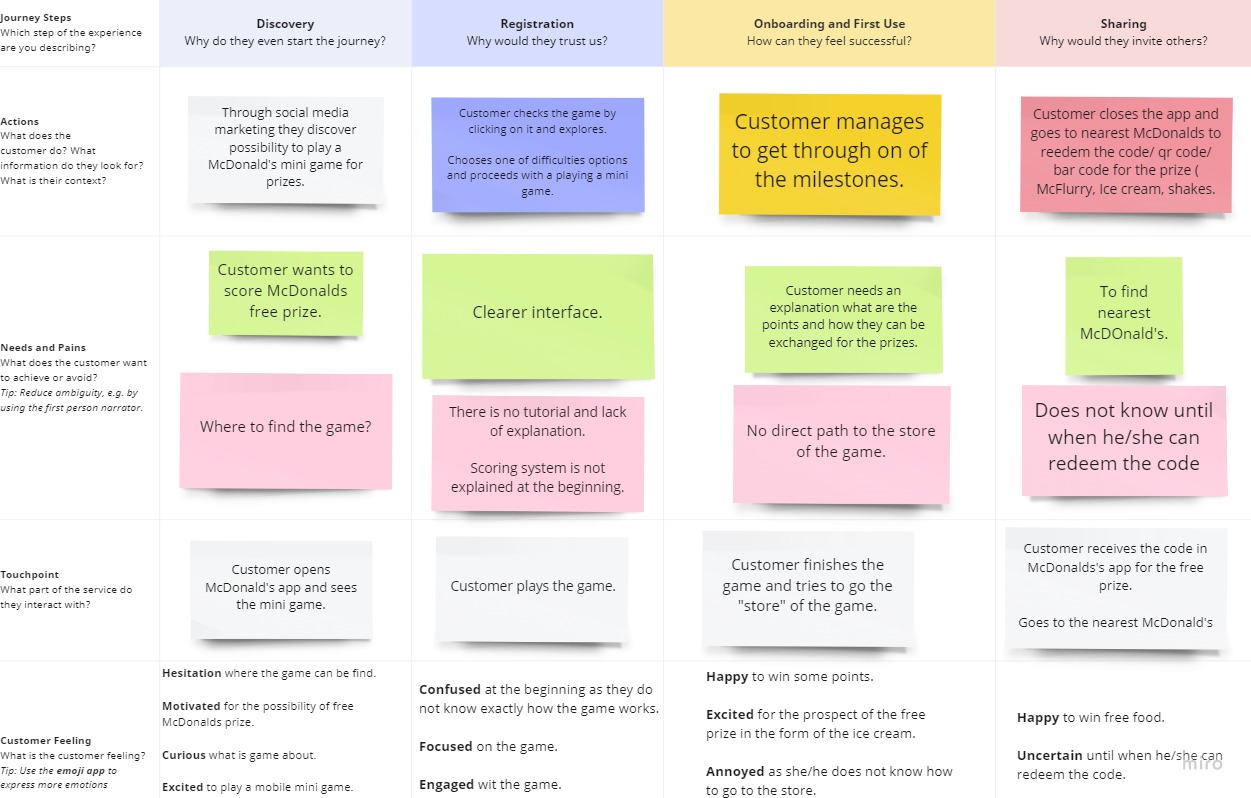
Customer Journey
We mapped the entire customer journey from discovering the game to redeeming rewards, identifying pain points and opportunities for engagement.
Game Concept
Core Game Mechanics
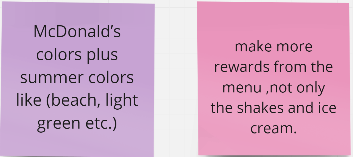
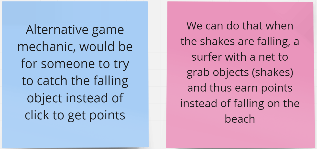
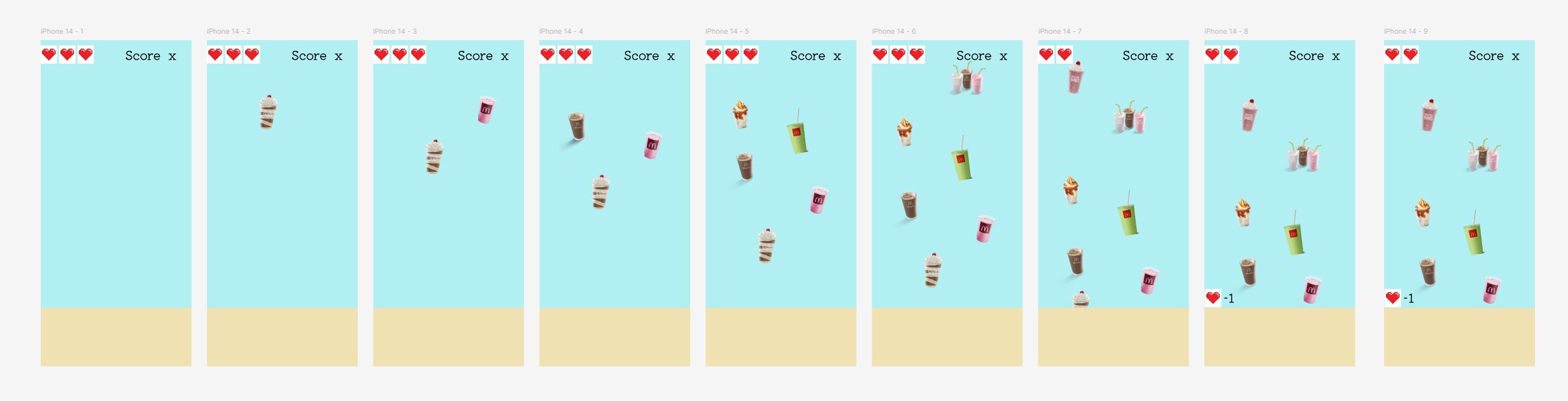
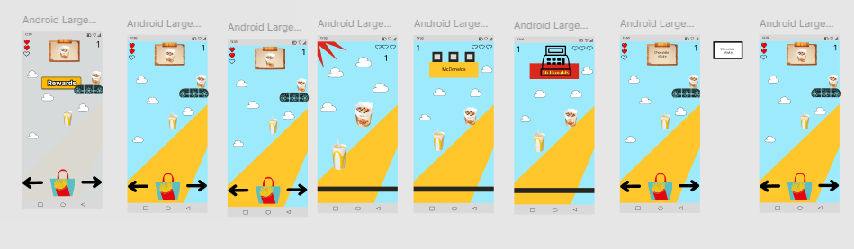
The concept is a mobile mini-game embedded within the McDonald's app. The player catches falling food products by clicking on them before they reach the bottom of the screen. Customers earn McPoints which can be exchanged for prizes like shakes, McFlurries, ice creams, and smoothies.
- Tap to Catch - Score points by clicking falling products
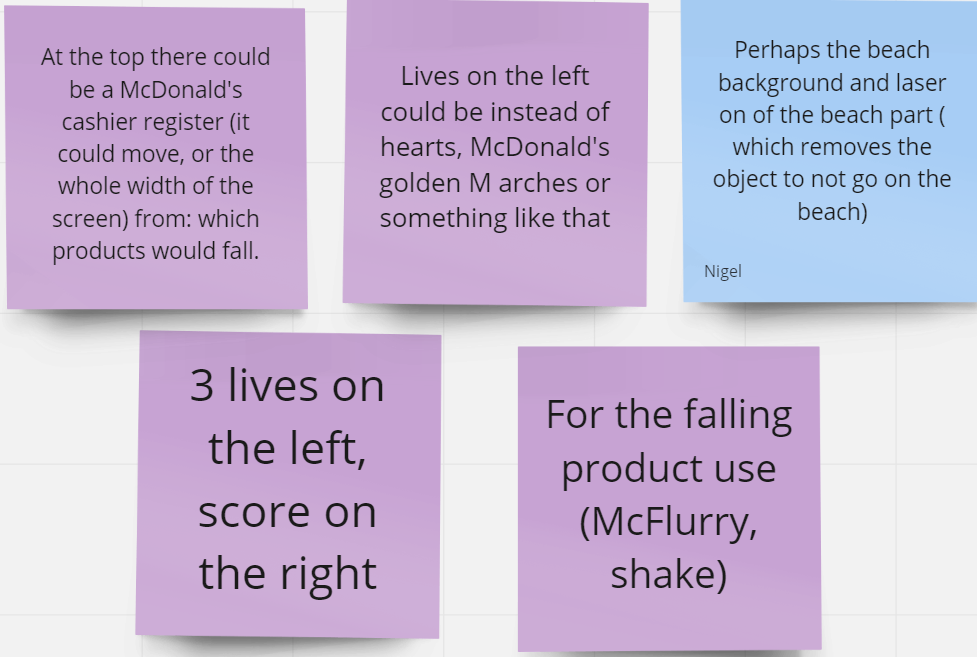
- Lives System - 3 lives create engaging risk/reward gameplay
- Difficulty Levels - Easy, Medium, Hard for all skill levels
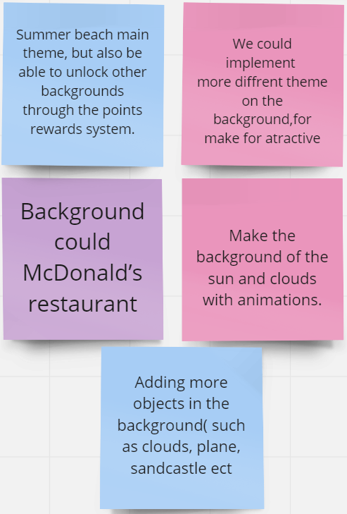
- Summer Theme - Beach-inspired visuals for seasonal campaign
Star Reward System
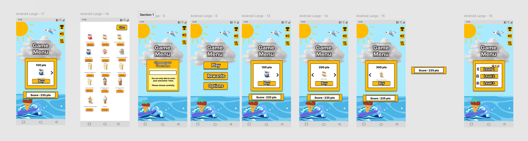
Players earn bronze, silver, and gold stars based on their score:
- Bronze Star: Score between 0 and 300 points
- Silver Star: Score between 300 and 360 points
- Gold Star: Score 360 to 450 points or higher
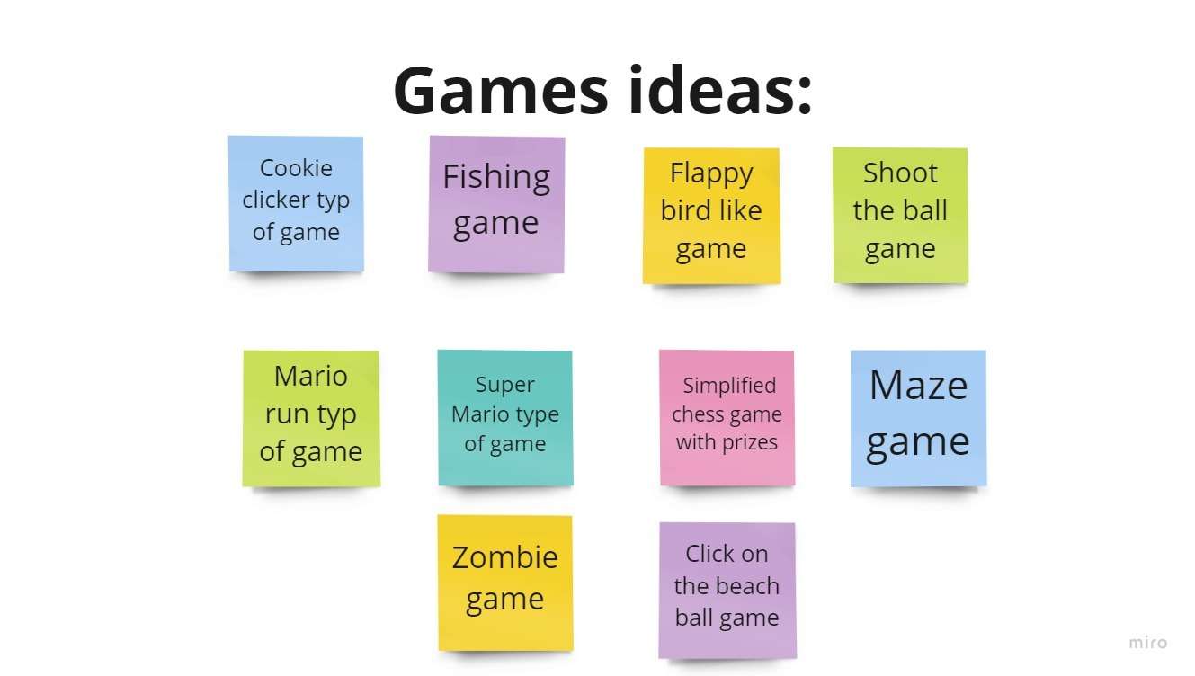
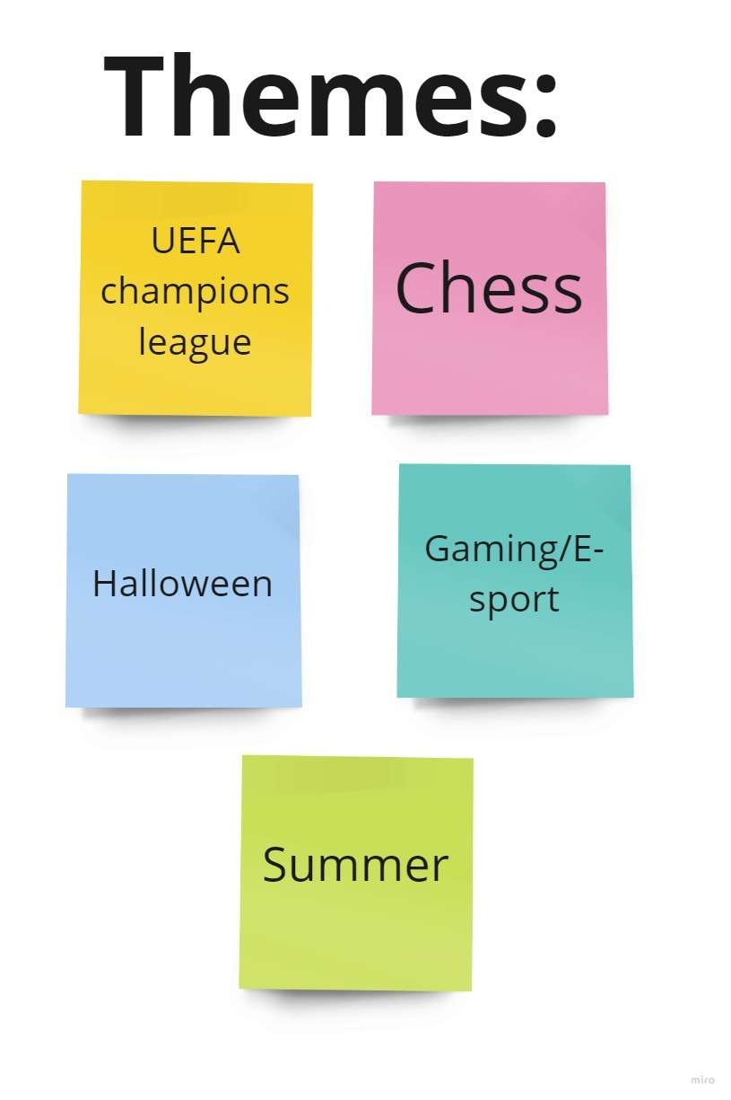
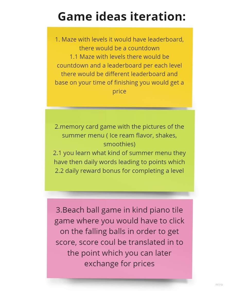
Ideation & Brainstorming
Our team conducted two brainstorming sessions to generate and refine game concepts. We explored various mechanics, themes, and reward systems. The sessions resulted in the "Falling Shakes" concept with summer theme and McPoints reward system.
Design Process
User Flow
We created a flowchart diagram in Miro. When starting the application, the user sees the game menu where a username can be filled in. After the username is added, the user is led to the Home Menu with several buttons available:
- Play Button: Opens page with levels. Once level is chosen, game begins. After game finished, win/lose message with option to continue or replay.
- Settings Button: Adjust volume, turn on/off music, change background theme.
- Rewards Button: Buy items with earned points.
- Profile/Leaderboard: Personal history, total score, achievements and avatar.
Sketches
Initially, we created 2 versions of the game home menu. We finalized by going with the first sketch. Here you can see the three main buttons: Play, Option, and Shop. Having the beach and sunny vibe as the background gives the summer theme.
Lo-Fi to Hi-Fi Evolution
We created low-fidelity prototypes in Figma to visualize the game flow and test core mechanics before moving to high-fidelity designs with McDonald's brand colors.
Design Feedback & Iterations
Feedback 1st iteration:
- Hearts are not filled and do not indicate if player lost a life
- What is the motivation in the game? Example: make people fill the paper bag
- Add collect the specific order to the gameplay
- Solution: Added conveyor belt, order board, proper heart indication
Feedback 2nd iteration:
- The order board is not obvious to the player
- Instead of words, use pictures - easier for players to understand
- Solution: Changed order board from text to picture-based for intuitive gameplay
Prototype
Figma Prototype Video
What: Interactive wireframe prototype built in Figma with clickable paths to gameplay and reward shop. When pressing Play, it leads to interactive gameplay. When pressing Reward, users can view their score and available items.
Purpose: To test our wireframes, we added interactions to gather feedback on the gameplay, design, and reward shop. Players have one chance to catch falling objects and can swipe through different rewards using arrows.
Result: The prototype helped gather user feedback that led to design changes: order board was changed from text to pictures for more intuitive gameplay, and hearts were properly filled to indicate remaining lives.
Code Implementation
What: Web-based prototype built with HTML, CSS, and JavaScript demonstrating the falling shakes mechanic. The player clicks on McDonald's products (McFlurry, shakes) before they reach the bottom line.
How: The game features a bright blue background with clouds, McDonald's color scheme, and falling food items. A line at the bottom indicates where objects stop - players must click before items reach it. 3 lives displayed as hearts, score tracking on the right side.
Result: This demo proved the core concept works: catching falling items is engaging, the summer theme resonates, and the reward system motivates players. Testing showed users want faster gameplay and additional difficulty levels.
User Testing
Testing Methodology
To test our design our group decided to conduct Guerrilla testing to gather valuable feedback from possible users. We conducted 5 interviews with participants in the age range of 19 to 26.
- Guerrilla Testing - Quick, informal tests with target users
- Task-Based - Users completed specific game scenarios
- Think-Aloud - Participants verbalized their thoughts
Key Findings
- Users want more challenging gameplay
- Proper difficulty-to-reward ratio needed
- Items should be more accessible in shop
- Add distractions for variety
Improvements Made
- Added progressive difficulty scaling
- Balanced McPoints rewards per game
- Expanded reward shop with diverse options
- Implemented distraction objects
Outcome & Results
Validation: The testing validated our core concept - users found the game engaging and understood the reward mechanics intuitively.
Key Insight: Most people would like to play this mobile mini-game if we incorporate more challenging gameplay, such as faster moving objects, distractions, and additional difficulty levels.
Next Steps: Based on feedback, the team recommended implementing progressive difficulty, balanced reward ratios, and expanded reward shop options for a future production version.
Explore More Projects
Check out my other collaborative and individual work!