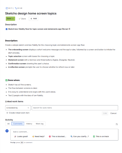
What We Built
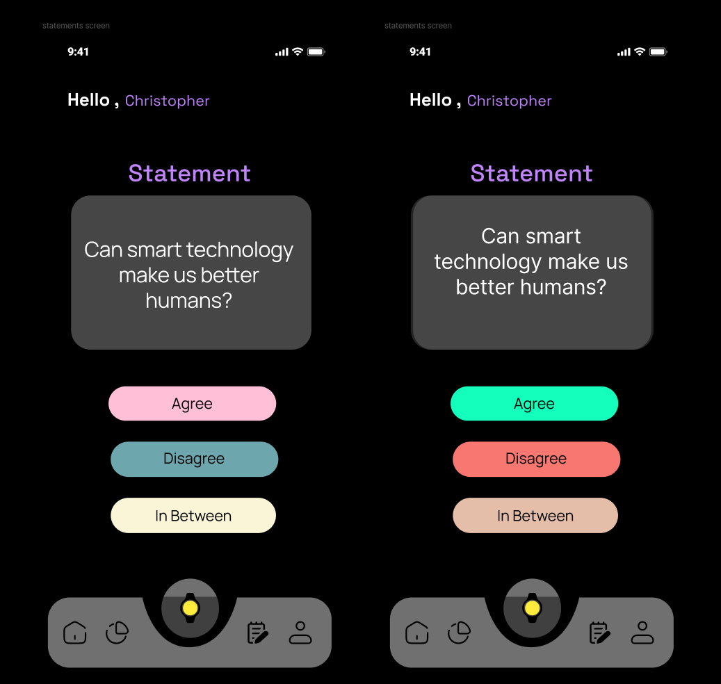
We created an experience where people can discuss topics through statements, combined with a digital bracelet that shows their opinions. Users express views with another person and learn different perspectives to reduce polarization. The app prompts users with statements like "Do you think smart technology makes us better?" and lets them choose Agree, Disagree, or Neutral.
User Research Findings
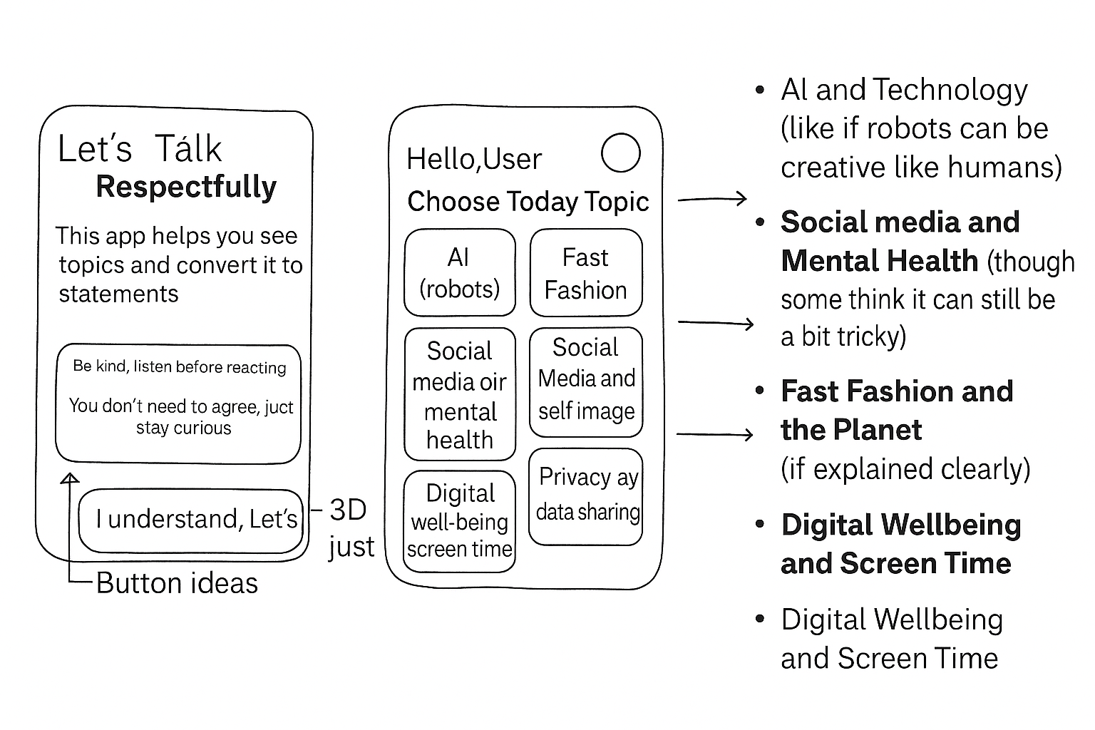
I interviewed three young adults (ages 18-35) to understand what topics people feel comfortable discussing. I used card sorting exercises where interviewees placed sticky notes to show which topics could cause problems in conversation.
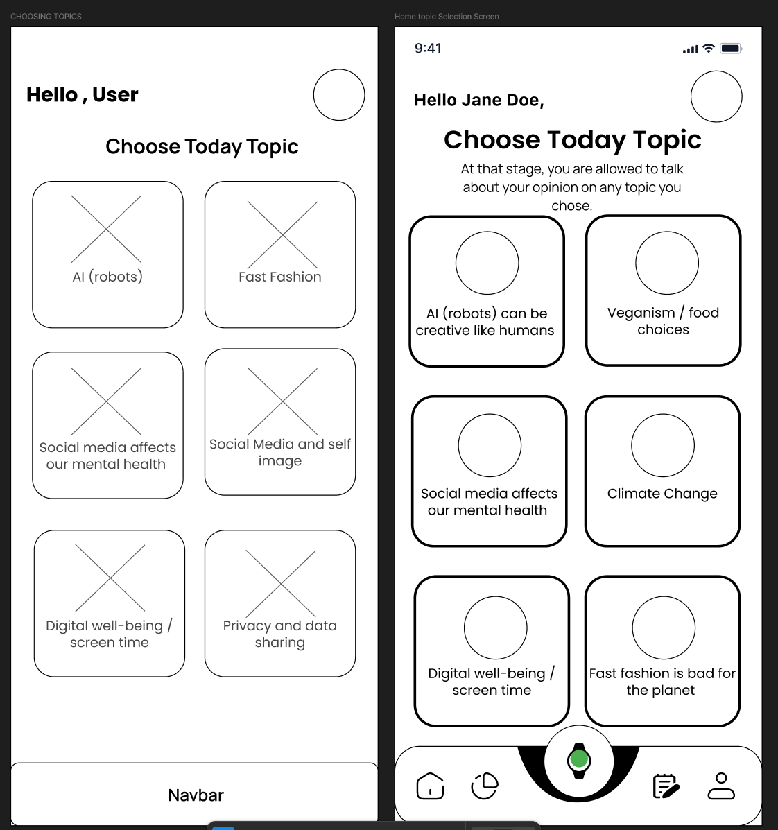
- Safe topics: Hobbies, technology, AI creativity, social media, fast fashion
- Avoid topics: Politics, religion, gender identity, climate change, money
- People feel safe when everyone gets a chance to talk and no one is rude
- Users preferred a digital bracelet over physical - could break or get lost
Sketching & Low-Fidelity Design
I started with paper sketches to explore different layouts for the statement screen. I tried a speech bubble version that looked like someone talking, but feedback said it represented a "thought not to be expressed." I changed to a simple rectangular box for clearer focus on the text.
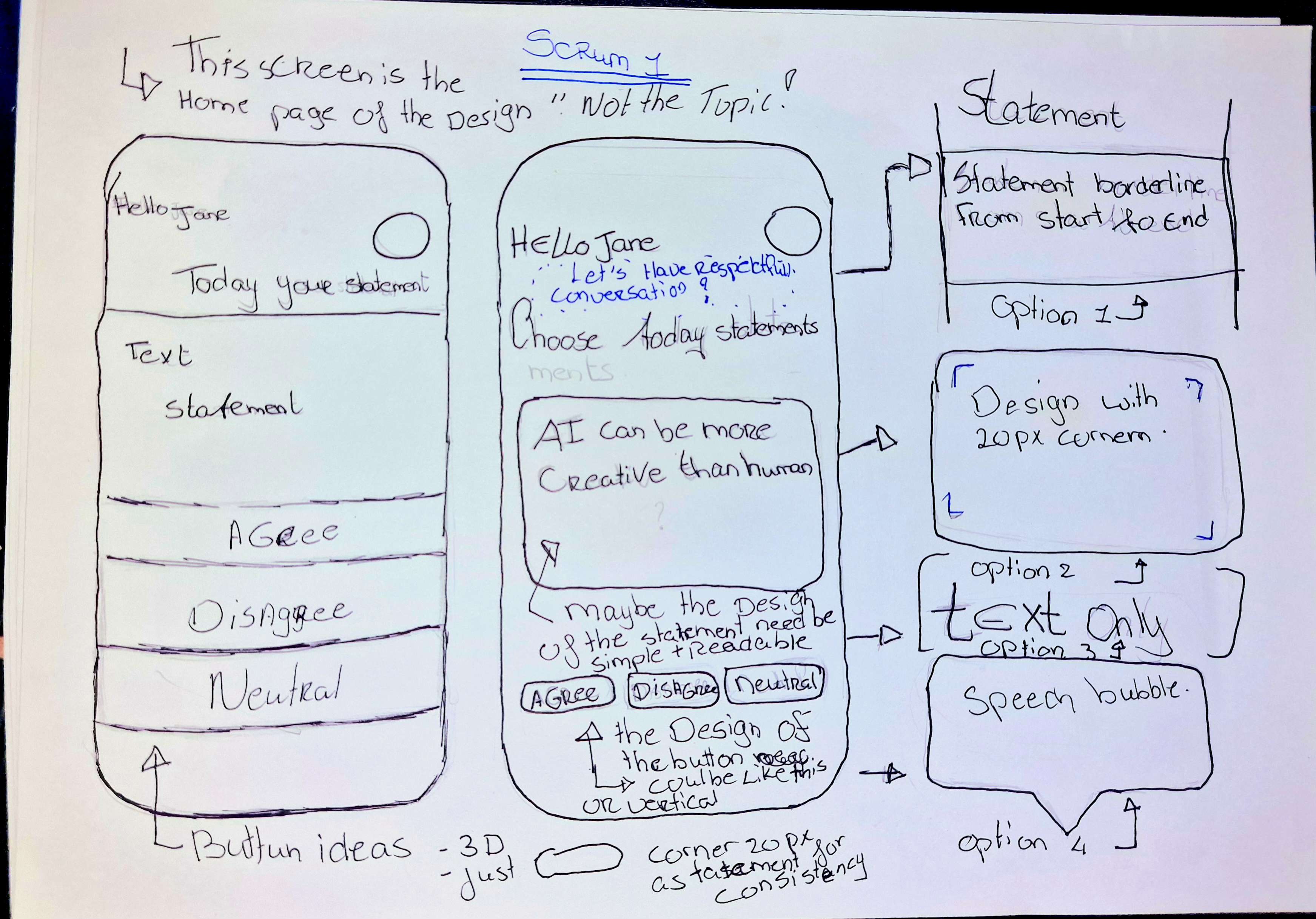
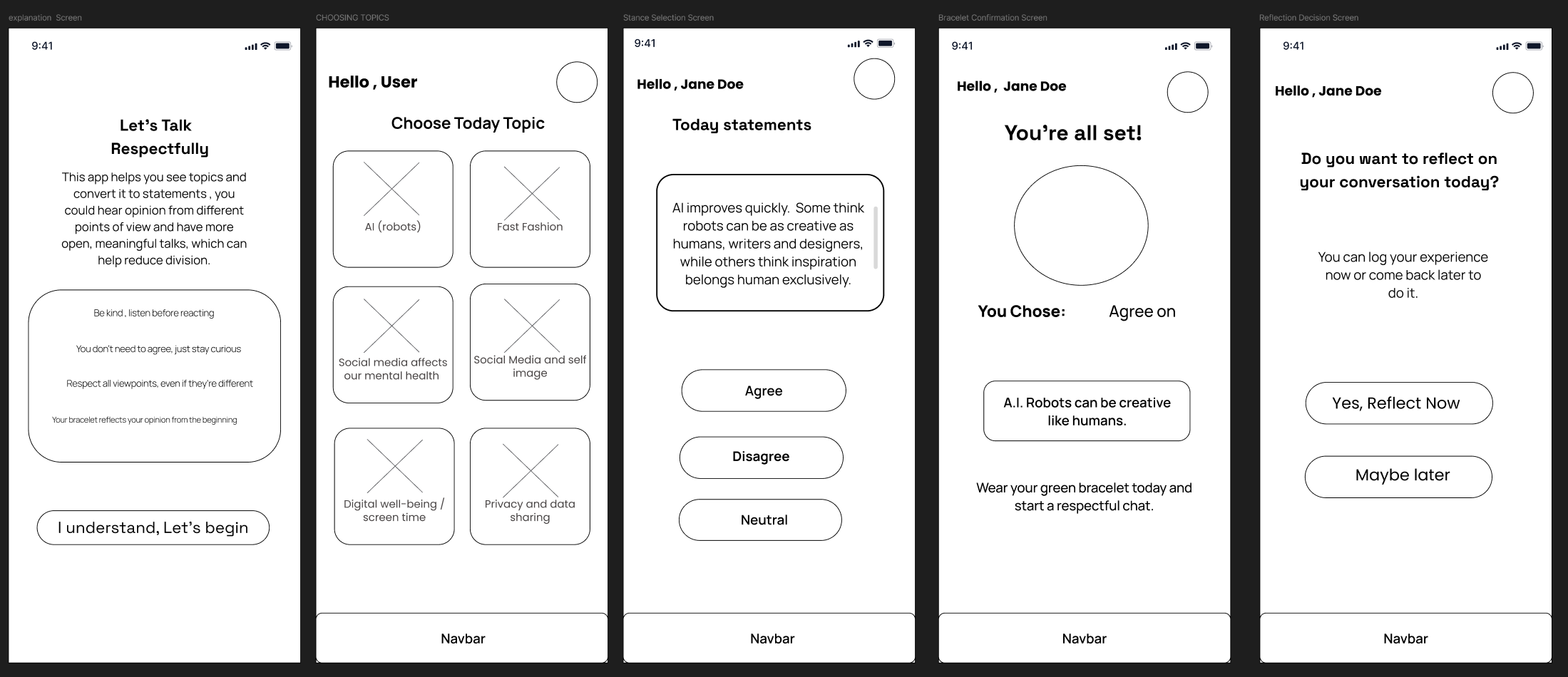
"I put a big box at the top for one statement. The user can read easy and simple. Below the box are three big buttons: Agree, Disagree, and Neutral. I tested vertical vs horizontal button layouts and decided vertical based on research."
Testing & Feedback Iterations
I tested my designs with the same three users from interviews. Key feedback included:
- The rules design box doesn't look attractive - needs improvement
- Statements are too long - need to be one phrase
- Buttons are too simple - not engaging enough
- Add a back button so users can review topics
- Add icons or descriptions - topics screen looks empty
Design Iterations
Based on stakeholder feedback, we shifted focus from event screens to matching animations. Feedback said the buttons looked like traffic lights - green to go, red to stop - not suitable for conversations. I needed to redesign with colors that encourage expression rather than caution.
My group suggested making my design consistent with teammates' work. Lisandra and Paola suggested matching the same style and fonts across all screens for consistency.
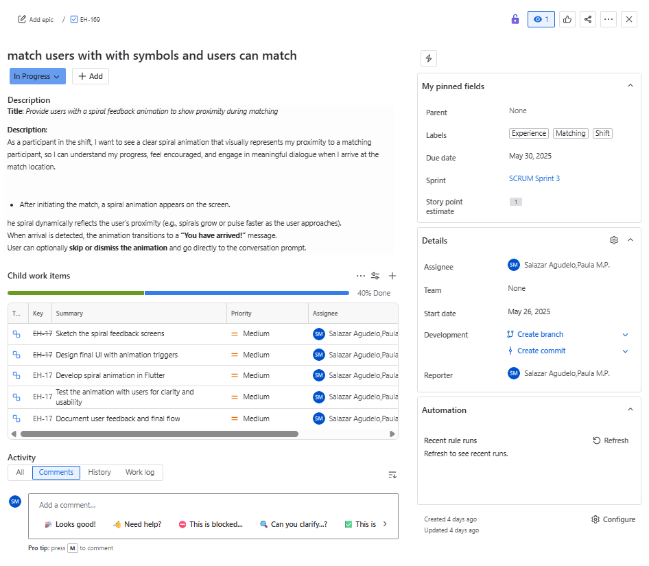
Final Design & Matching System
After brainstorming with Lisandra about matching animations, we created a flowchart showing how users connect. When two people with the same opinion are nearby, they draw a spiral symbol on screen. A radar shows vibrations and beeps indicating how close they are to each other.
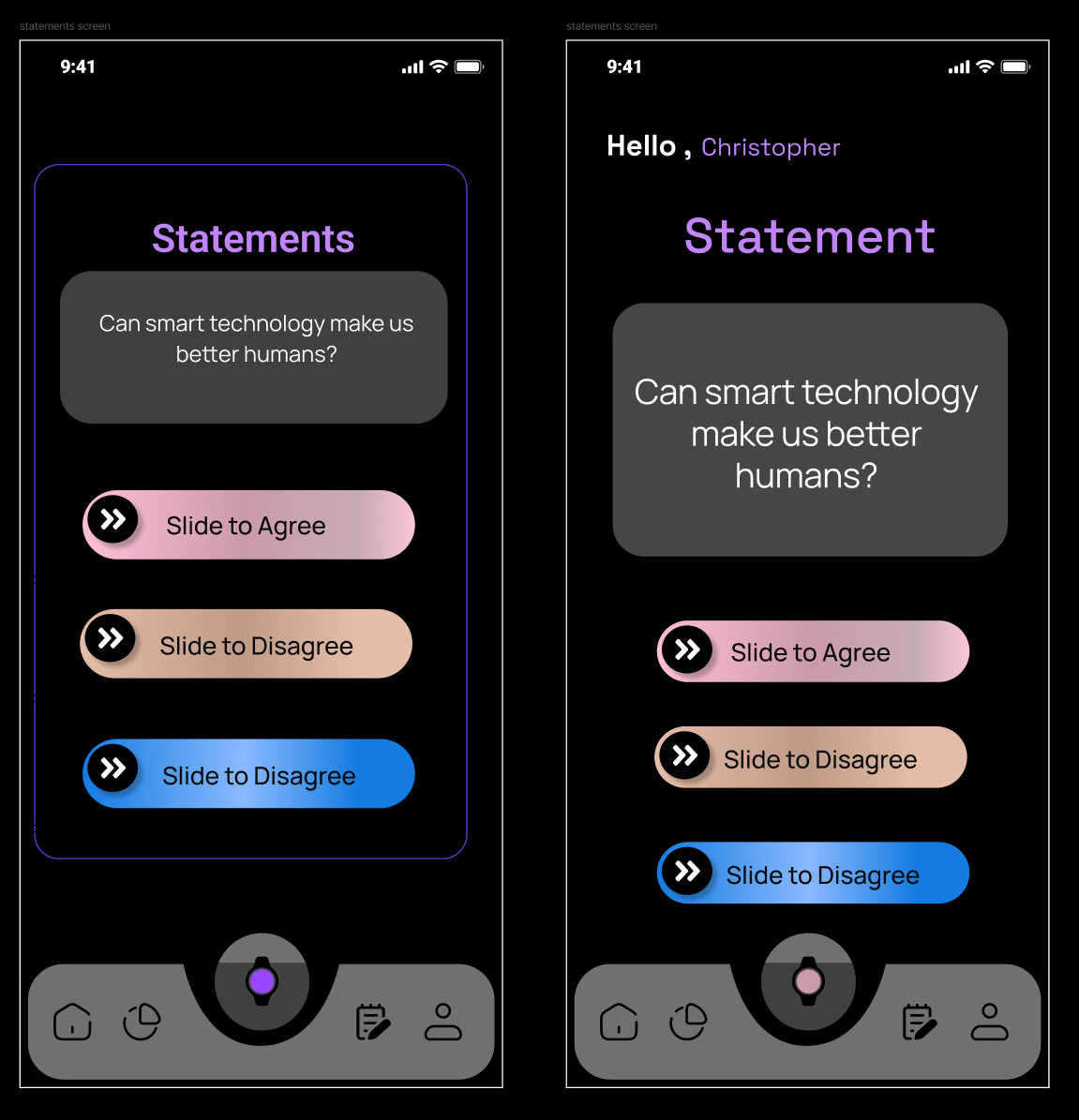
I tested vibrant vs pastel colors. A graphic design workshop taught us that color contrast and font choice are crucial. Feedback: the black app background looks dull - doesn't seem like an app for connecting people. We needed brighter, more colorful backgrounds.
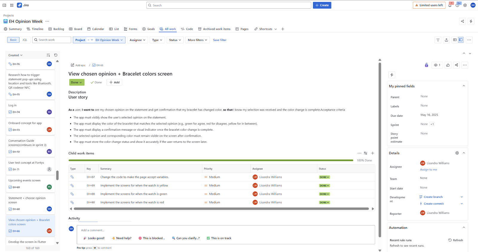
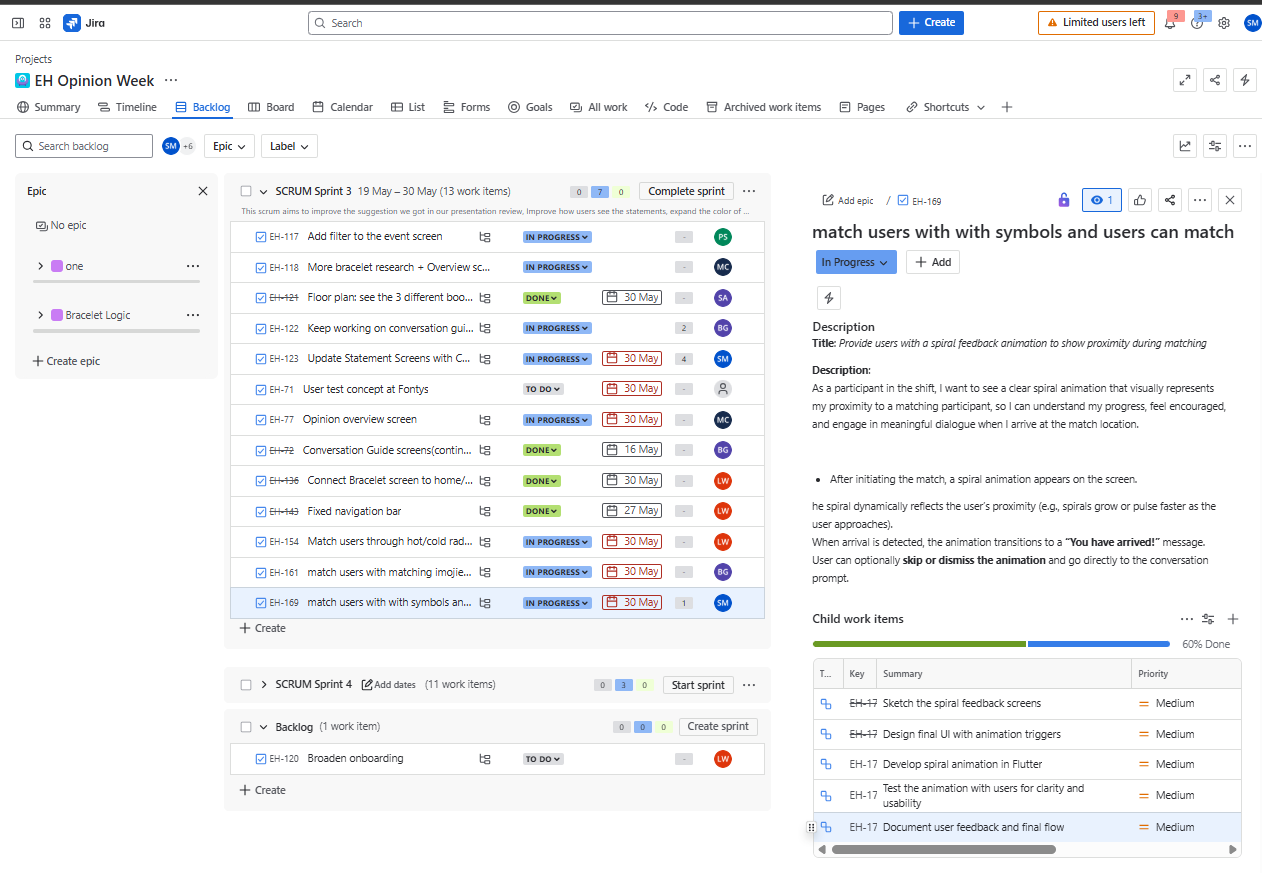
Working with Jira & Scrum
We used Jira to track user stories across 4 sprints. Each sprint lasted 2 weeks with testing and feedback sessions. I learned that Jira is "how a team thinks together" - documenting sketches, feedback, and iterations helped us stay aligned.
A minor challenge: my teammate and I weren't always perfectly synchronized, which sometimes caused mixups. I learned to check in with teammates early and ask for teacher feedback more often.
What I Learned
"One of the biggest lessons was how helpful sketching can be in the early stages. I was able to explore different designs and get feedback before spending too much time in Figma. Design doesn't have to start on a screen - sometimes the best ideas come from simple drawings and conversations."
Key Takeaways:
- Testing every 2 weeks made us work faster and catch issues early
- Location tracking taught me how longitude and latitude trigger actions based on user position
- I got off track working on screens outside my user story - learned to stay focused and check in early
- Starting documentation earlier would have helped - writing reflection at the end felt overwhelming
- Teacher feedback was invaluable - without it the project would have been very difficult
What I'd Do Differently:
- Put more time into testing code early - could've saved guessing later
- Document as I go, capturing key decisions along the way
- Get more comfortable with coding while focusing on design
- Improve Figma skills and work better with components
What We Used
View Project Repository
Check out the code and documentation on GitLab